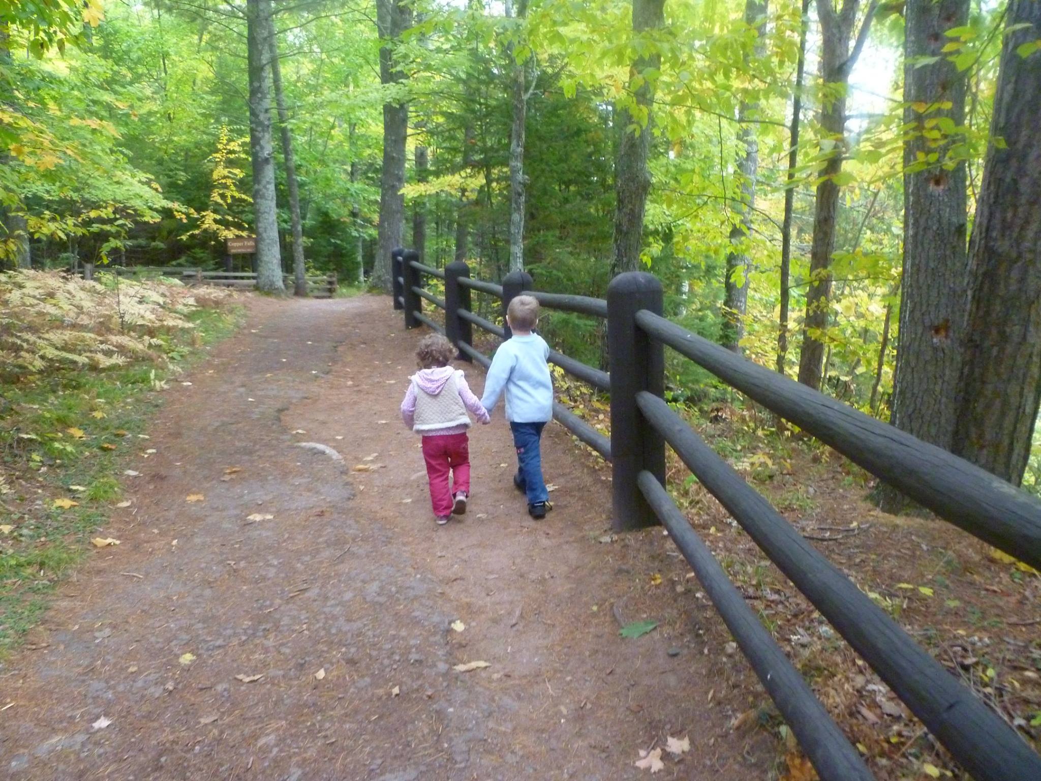
Here is a new painting in progress–a 16 x 20 acrylic on canvas. This will be a book cover for a compilation of Charles Spurgeon’s devotionals for children, called “Come Ye Children.” Based off this photo I took of my two children when we were hiking in northern Wisconsin.
Reference Photo
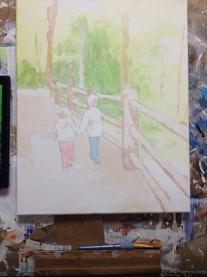
In Progress Painting
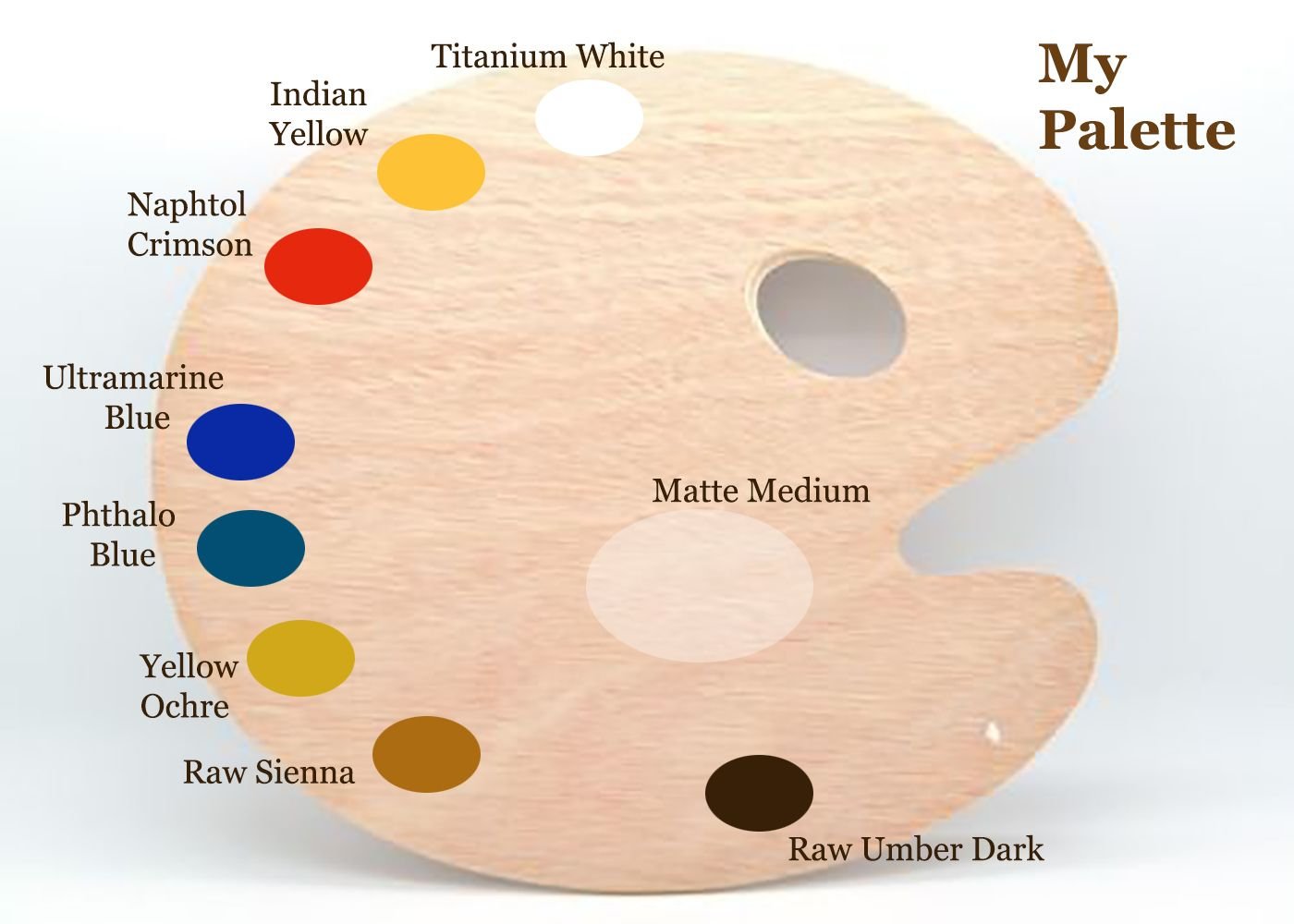
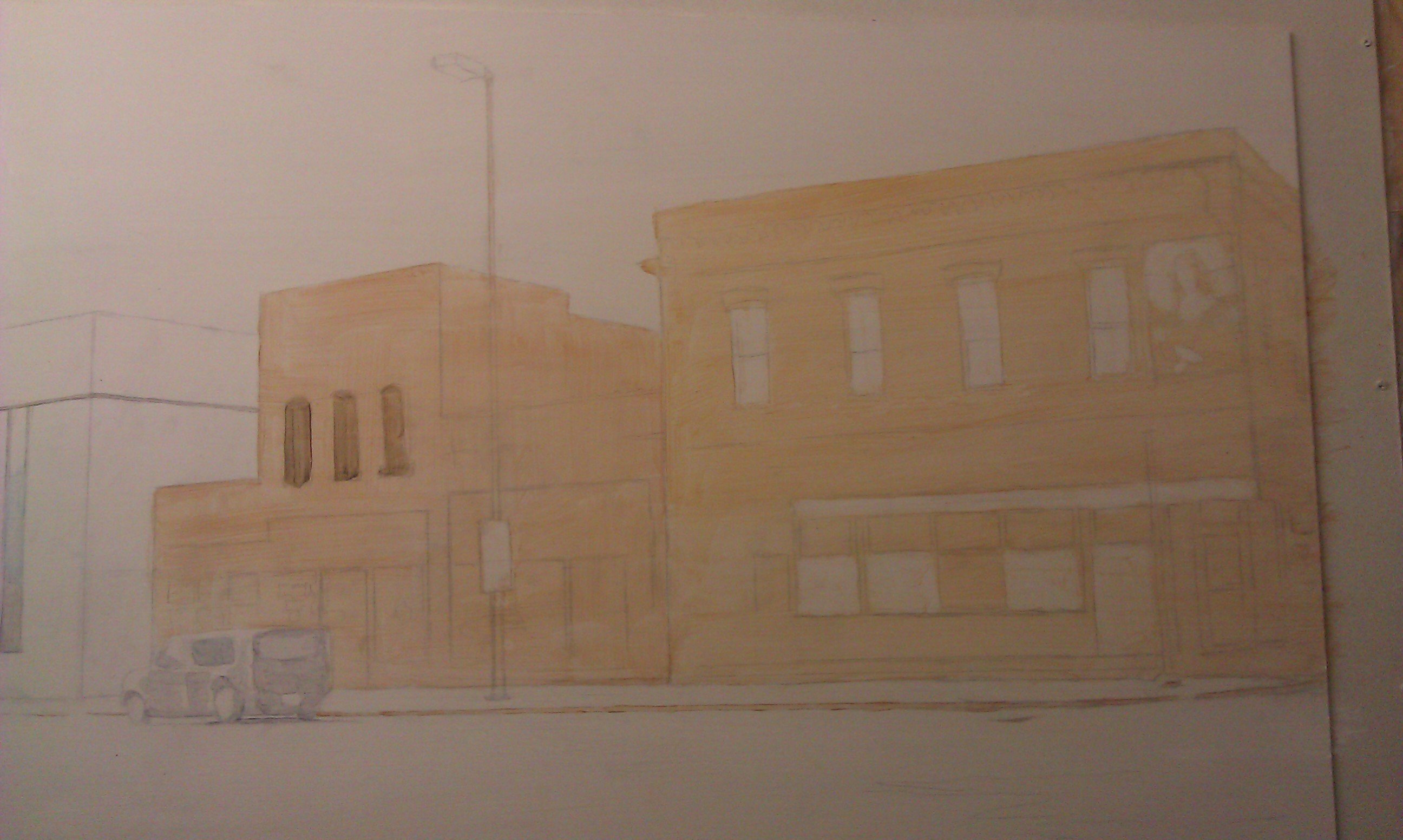
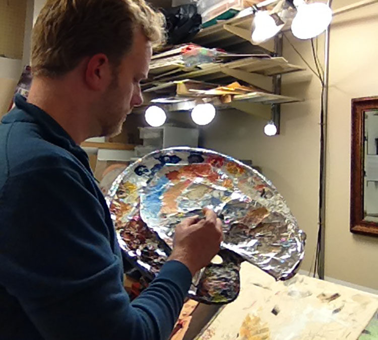
I start off very faint, just blocking in the colors with glazes. I mix about 90% clear acrylic medium to about 10% paint and just block in the composition, suggesting where the future colors will go. Here is my palette…
Normally, I use burnt sienna, but to challenge myself and also to enhance the color harmony within the painting, I omitted it.
Video Demonstration
The first layers consisted of raw sienna, yellow ochre, phthalo blue and indian yellow for the background, and then for the posts: raw umber dark, ultramarine blue and napthol crimson. I blocked in the blue jeans with phthalo blue, and my daughter’s pants with napthol crimson.
I’ll be posting more on this and show you the process of how the painting develops.
Have a blessed day,
Share Your Thoughts!
If you have any comments or questions about what I wrote, please leave me your feedback below! I will personally get back to you. Can you help me spread the word? Please share this post with your family and friends by using the social media links on the side or below. Thank you!
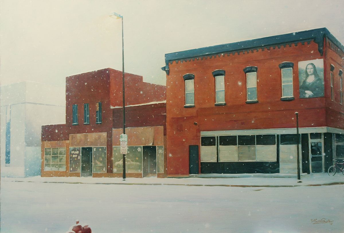
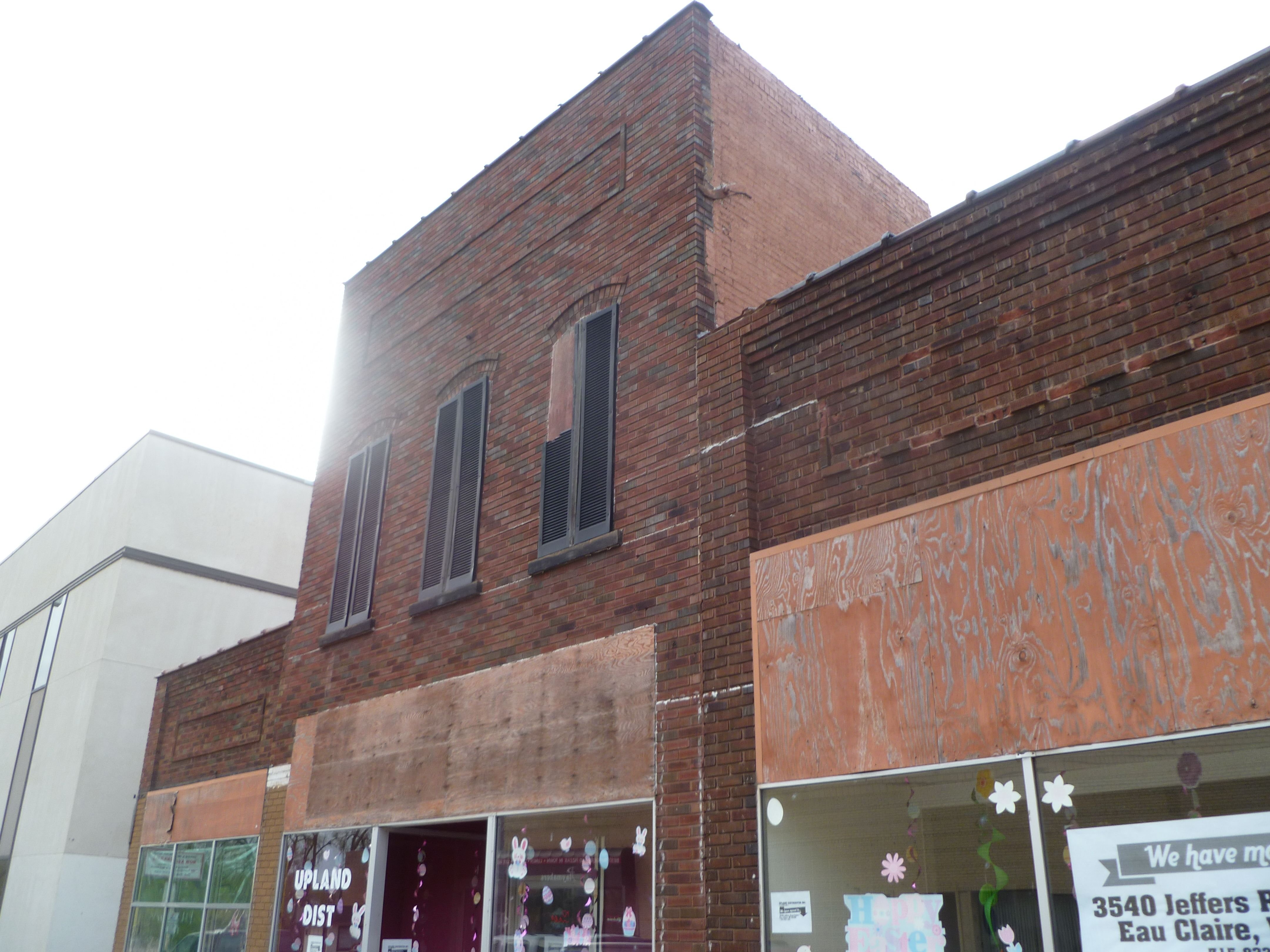
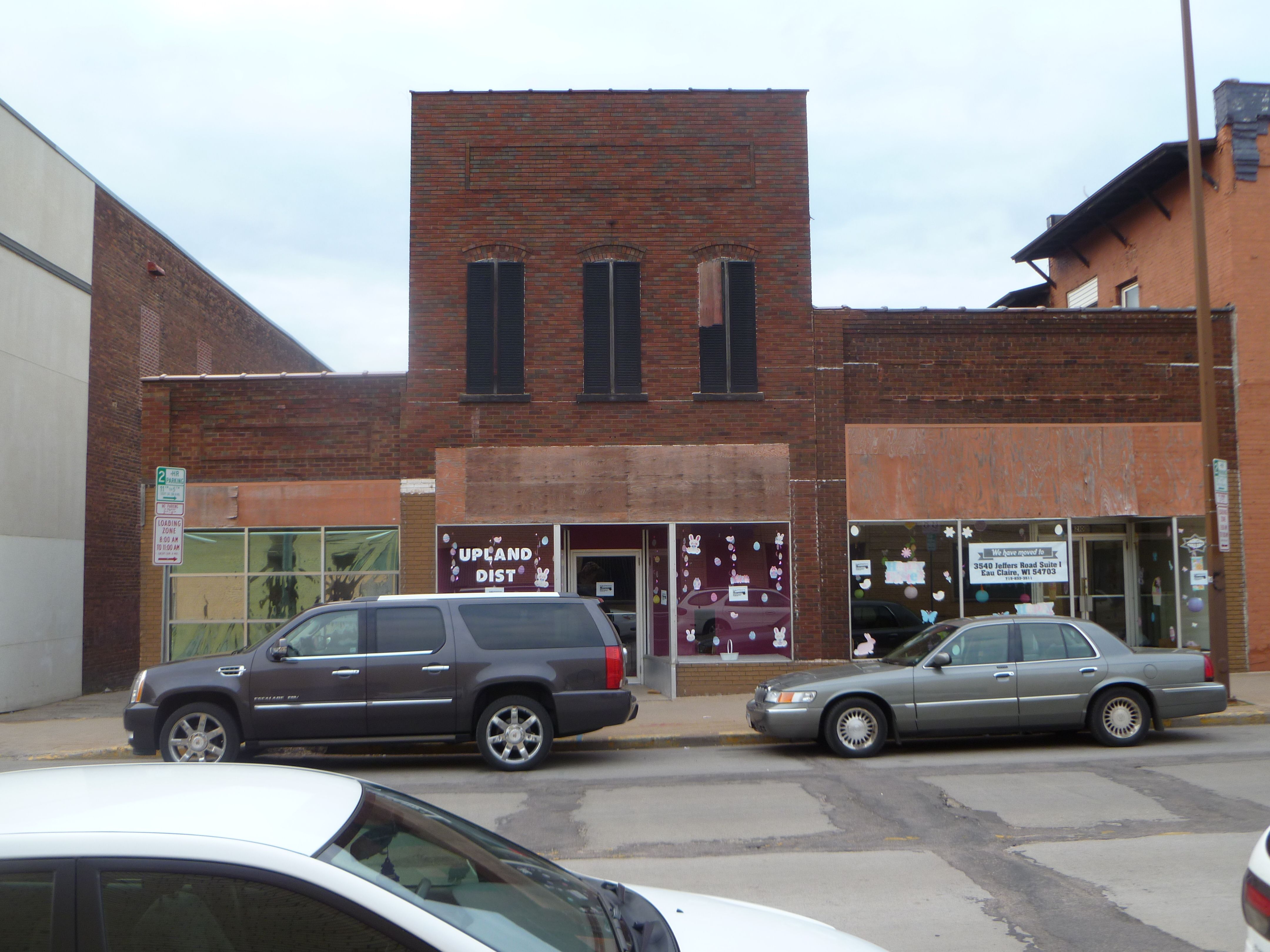
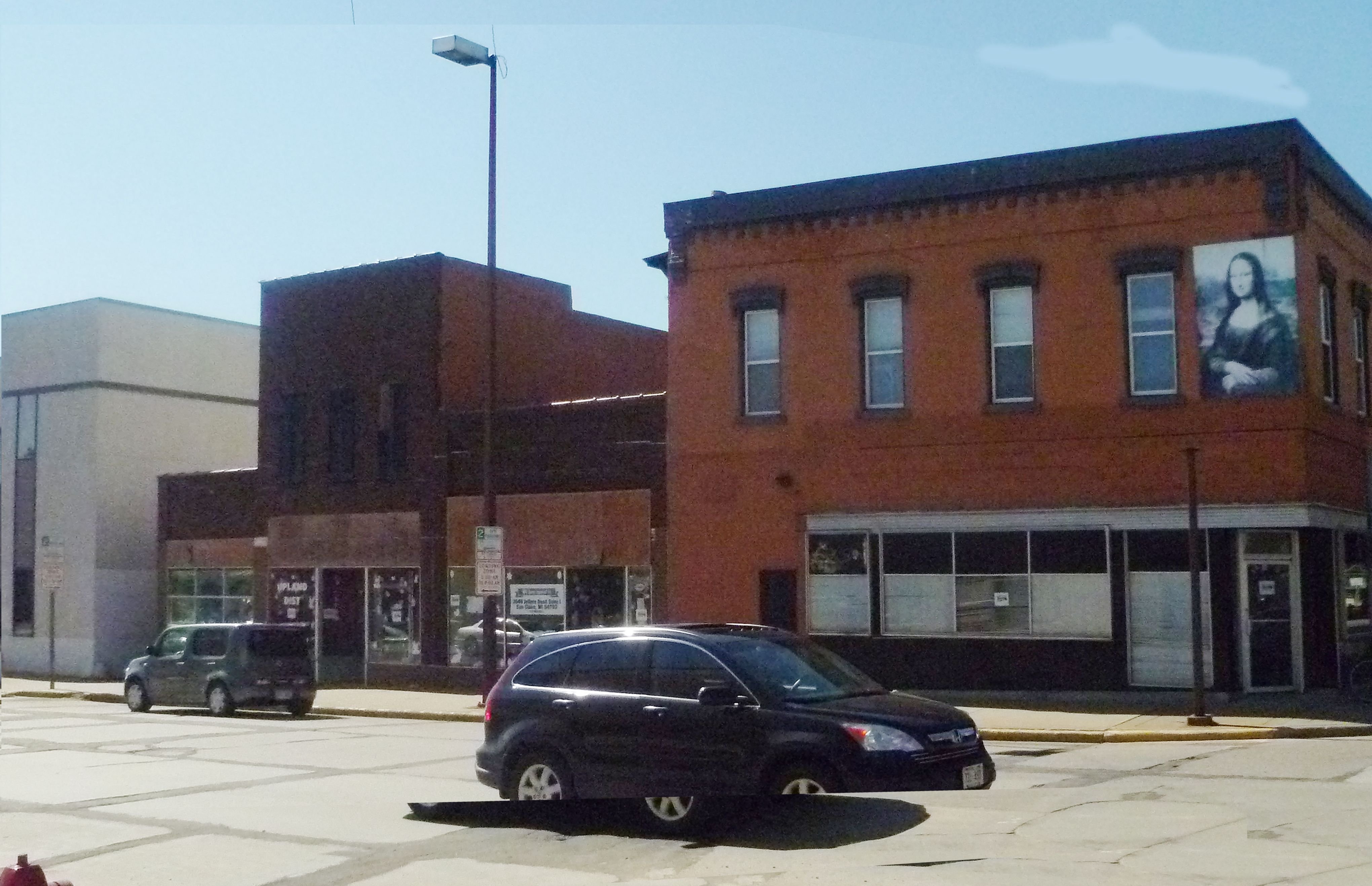
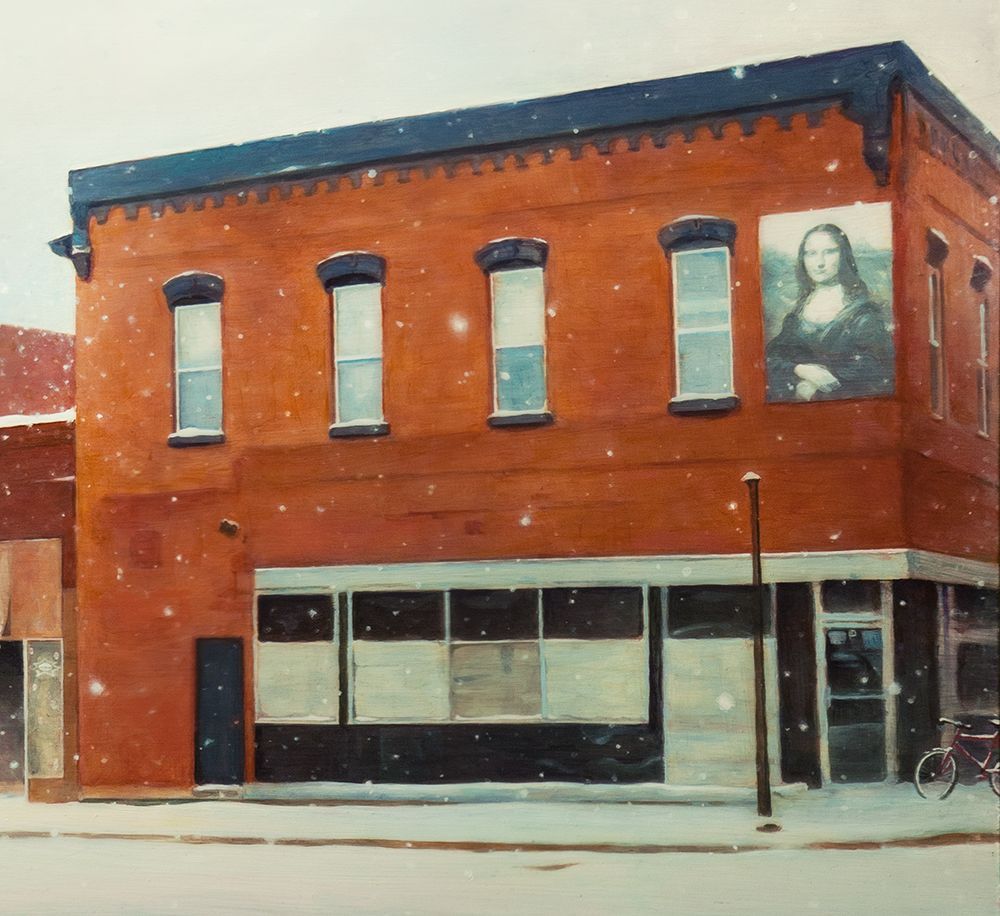
Here is a painting I did of a building in my town that is now no longer there.
I title this “The Original Upland,” (24″ x 30″, acrylic on hardboard) because it used to be the home of Upland Distributing, Inc. a vacuum and filtration sales and service company where I used to work years ago, as a traveling service technician.
While I worked there I built up a relationship with my boss, the owner.
Since I knew the building was slated to be demolished soon, and the owner would have to move his business into another building after being there for nearly 20 years, I thought a painting would be an encouragement to him. It would help keep the memories alive.
It was something I felt God wanted me to do to bless him, and I waited for a while, but when I knew that demolition was imminent, I got out my camera and took some pictures.
Maybe I’m a newbie at camera lenses, or I just tried to do the best I could with my small digital camera, but backed up by the buildings on the other side of the street, I couldn’t get the angle I wanted for image.
So I took a few images and “frankensteined” them together on Photoshop, using the warp and perspective tool to change the angle of the building to match the photos seamed together.
Never mind the cut-up-half floating car!Thatwon’t be in the actual painting!
With this layout, I now had an image to paint! Here’s the step-by-step process…
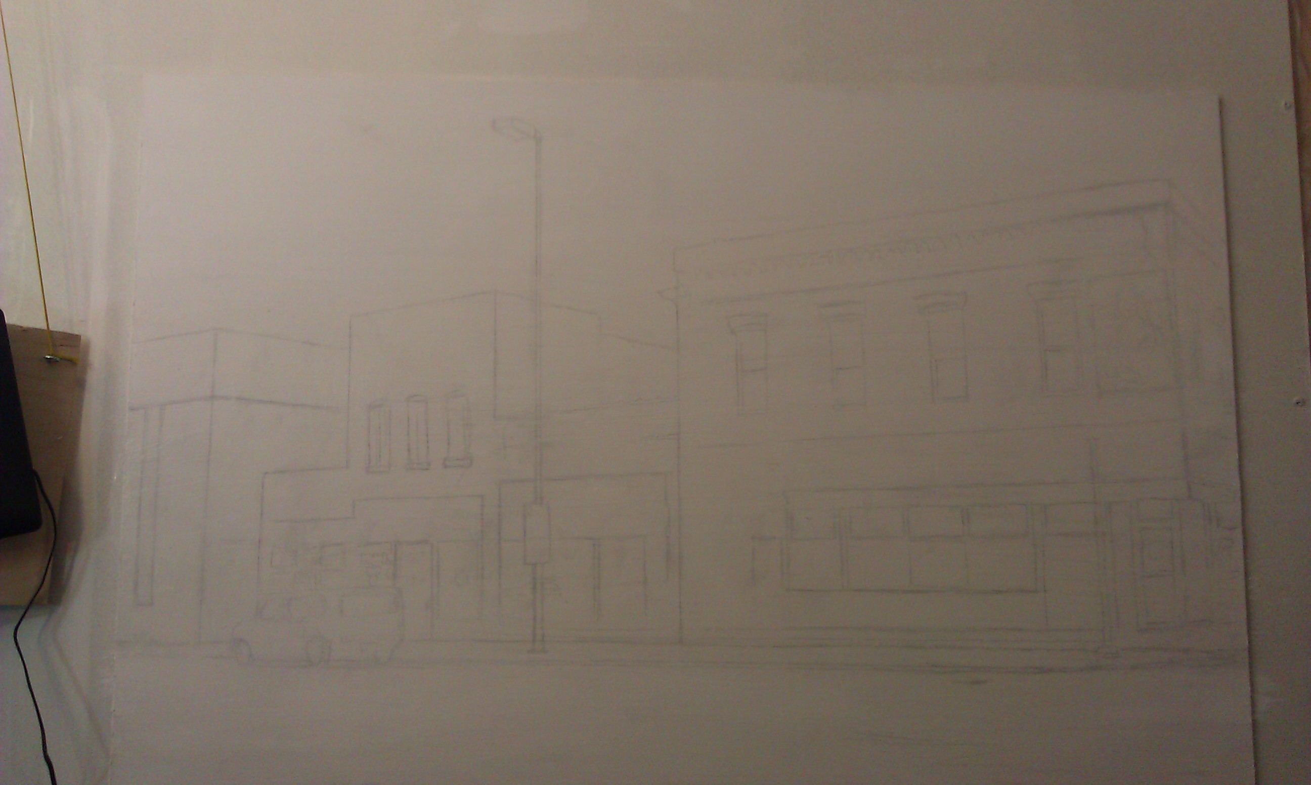
Step 1: The Sketch
I made this very simple–just some lines, using a projector and a ruler to double check the angles. A projector can really distort your image, so you’ll always have to double check using your proportional skills and a ruler for straight lines!
After getting the sketch done, it was time to fill in with paint. I use acrylic mixed with matte medium to thin it out and make glazes. Everything starts out very light.
I used these colors:
Raw umber dark
Burnt sienna
Alizarine crimson
Phthalo blue
Raw sienna
Yellow ochre
Indian yellow
Titanium white
Ivory black
Step 2: The Underpainting
In this step I block in the initial color of the building. The goal is to create a lot of contrast right away and make the orangish-brick colored building stand out against the pale white background of the snow and sky. Using burnt sienna and raw sienna with a heavy amount of clear acrylic medium to dilute it, I fill in the areas rapidly with a 1″ flat brush.
It’s the perfect size: large enough to cover the area quickly, but small enough to “cut in” around windows and trim. Sounds like house painting!
Step 3: Defining the Darkest Values
Unless you get a sense for the darkest values within a picture, you’ll never know how dark to go with the medium and light values. So in this step, I darken in the window ornamentation, and the molding on the top of the building. I use a mixture of blue and brown, and I don’t want it to be too dark.
Why?
Because I’m trying to create the look of snow falling. You’ll notice as you look outside on a snowy day (I did on my drive to the studio) that when fine snow flakes are in the air, you don’t see just a lot of white specks. But the colors on everything–especially objects in the distance are muted.
Did you notice something? Or rather something that’s missing? I took out the vehicle that I originally had in front of the building. I decided that I wanted to show more of the details of the large glass windows, and that vehicle was getting in the way.
But to make the composition more interesting, as you’ll see, I add in a snow-covered fire hydrant. It also reiterates the reddish color of the building.
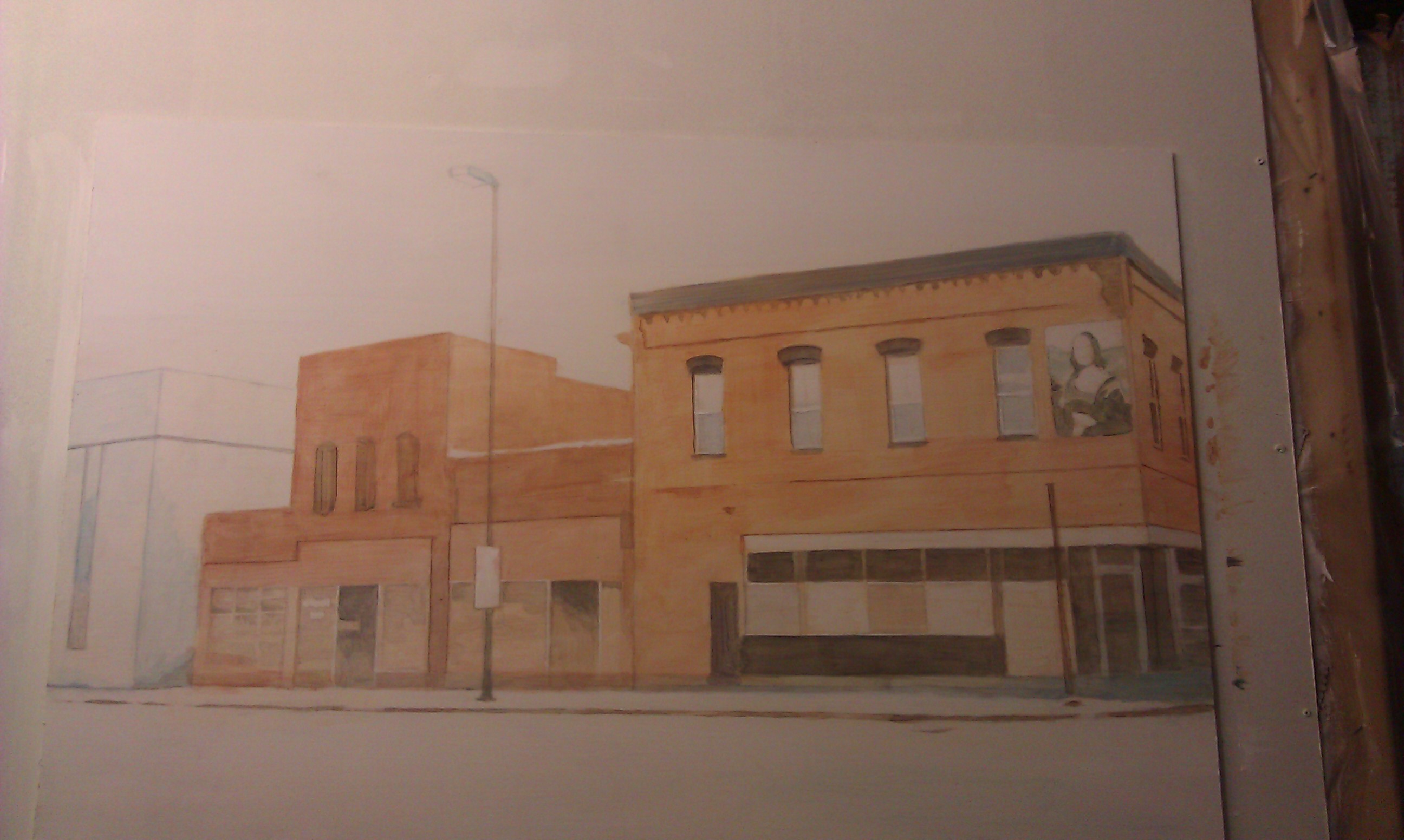
Step 4: Enriching the Colors
This is where it gets fun. All the colors get enriched. I add several layers of burnt sienna and raw sienna to the building, making some areas darker than others. I want to create the look of old brick that is maybe a little dirty in some spots, and catches the light a little bit in areas that are angled towards the sky.
Also, I really add in some details to the Mona Lisa image on the building. That’s a trademark of several buildings in downtown Eau Claire. But in this case, the image has faded after several years, so I paint it with bluish colors, just as I see in my reference photo.
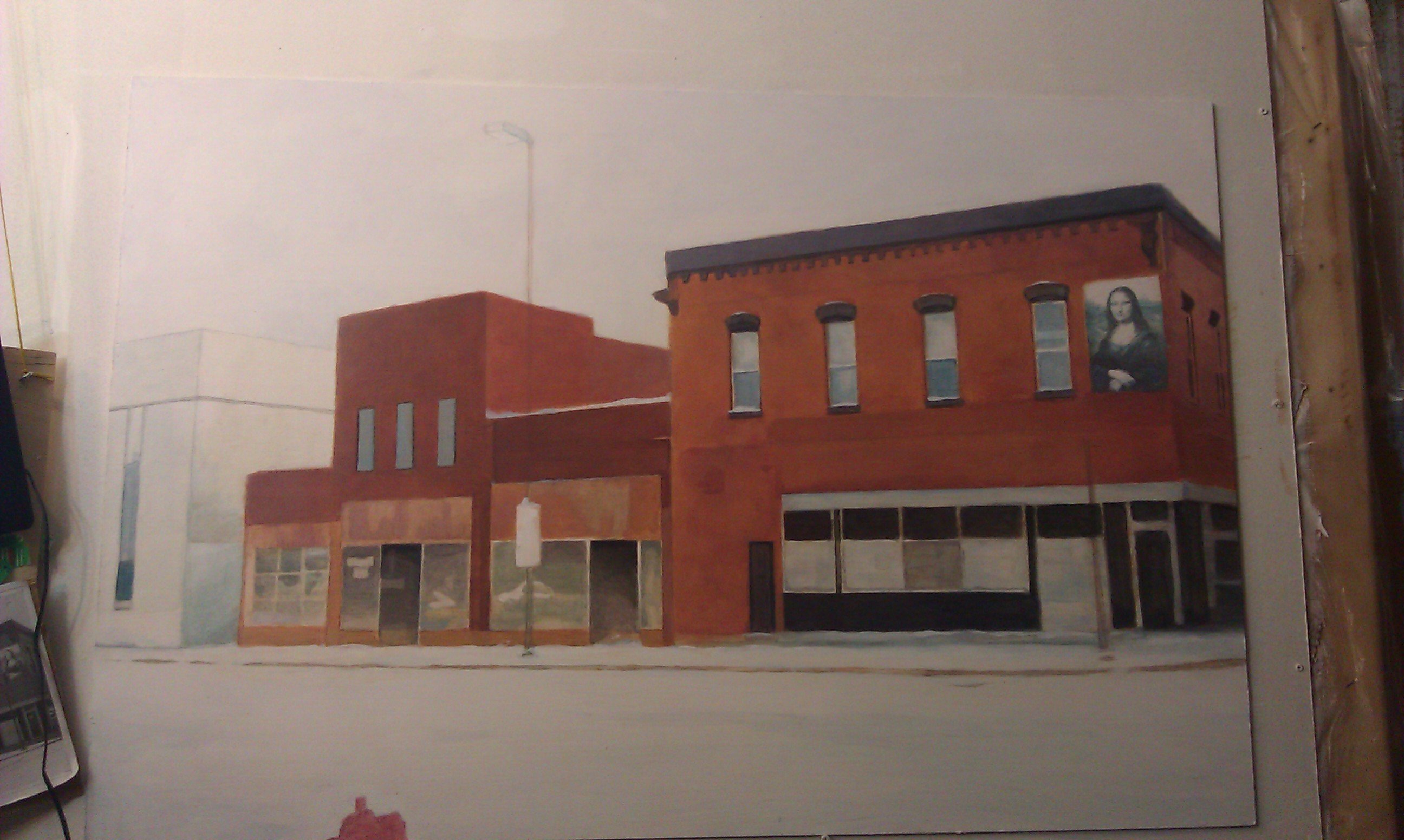
Step 5: The Final Touches
Now the painting is very close to being done. But the final effects really enhance the overall presentation. I add in a lot of snowflakes of various sizes to create that three-dimensional look of some being closer to your line of vision than others.
Next, I make it look as if there’s Christmas decorations on the business’ front window. And last but not least, the details of the 2-Hour Parking sign. That was a very important detail to include, because the business owner recalls how he had to move his vehicle several times to avoid getting a ticket.
All part of the memories!
Finally, just to add some charm: a bicycle, again covered by snow. We have people in our city that bike year-round. I should know. I’m one of them! I made the bike facing towards the painting, intentionally to lead your eye back into the composition.
Now, here are a few detail images so you can see it a bit closer up.
When the painting was done, I gave this to my old boss as a gift, which he now proudly hangs in his new office!
I figured I’d share this painting with you since we are still in the gift giving season. And also in much of the world, that charming season of fresh white snow covering the old memories of the year gone by, symbolically cleansing and preparing a way for the bright promises of a new year!
Be blessed,
Share Your Thoughts!
If you have any comments or questions about what I wrote, please leave me your feedback below! I will personally get back to you. Can you help me spread the word? Please share this post with your family and friends by using the social media links on the side or below. Thank you!
It will help get you on the right track in using color and value and correctly, so that your acrylic portrait painting looks lifelike.
All of this is in a standard 8 1/2″ x 11″ printable guide that you can keep for easy reference. Although it will not solve all your painting problems,you’ll be able to use it as an excellent tool to get your painting going in the right direction, or even give you some solid principles to go by if you’re stuck. Let me know what you think of it and how it helps.
Be blessed in your painting adventures and I’ll be in touch!
1. The first thing you need to do is login into the Realistic Acrylic Portrait School
At this screen, click the “Login” text in the upper right. (Not the “sign up” button, but the one next to it)
2. Enter your information (email address and password you created.)
Click “Log In”
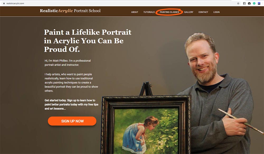
3. After logging in, select, the “Paint Your First Amazing Acrylic Portrait” course on the left (if this is the course you want. Most students start with this one or go with the All-Access Membership.)
4. It will take you to this screen. Click the “Enroll in Course” button.
5. Then, select your payment plan. You can pay in full for $97 USD or you can do a three-month payment plan, allowing you to get started for $39 USD today. But you will save $20 by paying in full!
After selecting your payment plan, click the “Enroll in Course” button.
6. Finally, enter your credit card or Paypal information and you can make payment securely online.
7. Click “Verify Payment.” Then finish the step, and confirm your purchase of the course, and you will be set! You will then be able to login like you did in step 1 and 2 and this time you will have full access to the course.
There is no time limit once you buy the course. You can use it as long as you wish.
Hope this helps… Look forward to seeing you inside the course!
It’s easy to get frustrated in the middle of painting an acrylic portrait. Possibly your skin tones aren’t looking natural, or the values are off. Maybe the portrait just doesn’t look like the person you’re trying to capture. When you’re going for realism, and it just isn’t happening, what do you do?
Although you may be tempted to give up, don’t.
I want to give you 3 reasons why:
1. You will save time, paint and materials.
Let’s face it. Painting is a labor of love. As artists, we could choose more lucrative jobs, where our exchange of time for money paid better. But we put a lot of hours into creating a high-quality unique work of art.
So if you have put several hours into a painting only to scrap it and start over, you lost that time. In addition, you lost money with the cost of canvas, paint, and wear and tear on your brushes.
Now, even if you paint just as a hobby, it’s frustrating to take the time to create something and then have nothing to show for that time you allotted in your busy schedule. Finishing the painting makes sense then, even from a purely material standpoint.
2. Pushing past a difficult point in your painting will build your resilience and grow your “artistic muscle”.
It’s easy to give up. Sticking with something when your thoughts and emotions are screaming, “This looks terrible…I’m done with this!” is way, way harder.
This is similar to weightlifting. Serious bodybuilders know they won’t get great results unless they push past the pain. As they break down their muscle tissue, they also break down barriers and limitations they previously had. With that, their muscles grow larger and stronger, because muscles don’t like to be in pain. Endurance and stamina increases.
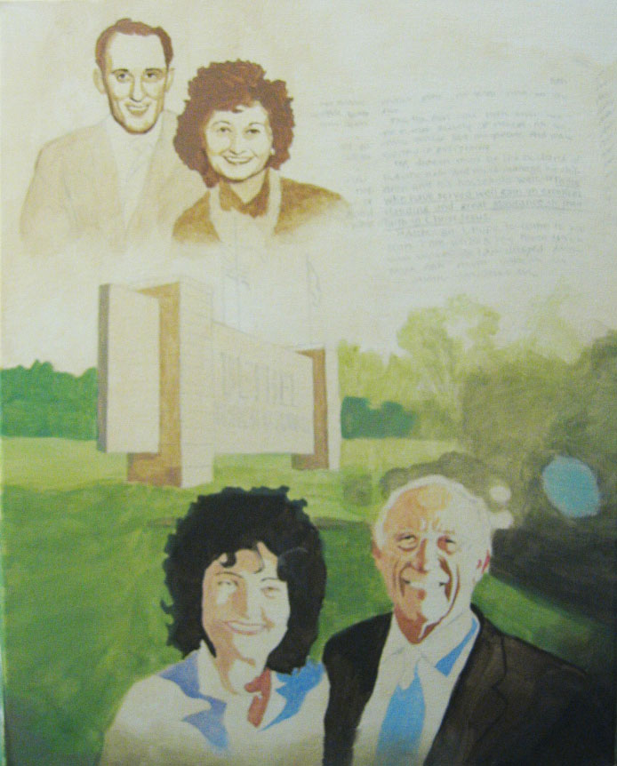
Several years ago, I created a portrait to celebrate my pastor’s 80th birthday. It was a portrait of him and his wife, a 16 x 20 acrylic on canvas. During a certain point in the painting, it looked pretty bad. My wife came upstairs (where my art studio used to be) and peered in to see how I was doing. She said, “That just doesn’t look right. I don’t know if you can pull it off.”
Umm…thanks!
I thought for a moment, “Can I pull this off?” Well, God helped me to “pull it off” many times. He wasn’t about to quit now. I ignored the doubt and kept at it.
I figured I had a photo that shows me what it should look like. I had a roadmap, a blueprint to tell me how to get there, how to build. And even if I took a scenic detour for a bit, I’d get it where it needed to be, eventually.
A painting is never ruined. It’s just that it might take longer to fix than you would like!
3. You will learn ways of resolving issues in your painting that you can use in future paintings.
In the case of this particular portrait, I learned that even though mid-stage during the painting process, the likeness of the subject may be off, I can correct the facial features with additional layers and it will start to look like the person.
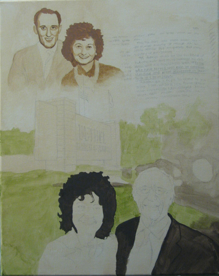
Here is the portrait in the beginning stages. Early on, there is a lot of excitement in creating a painting. I had great expectations for how it would turn out, and I cut myself a lot of slack, because I knew I just started it.
Portrait of Pastor & Mrs. Philip Palser, 16 x 20, acrylic on canvas, 2005 by fine artist Matt Philleo, Step 1
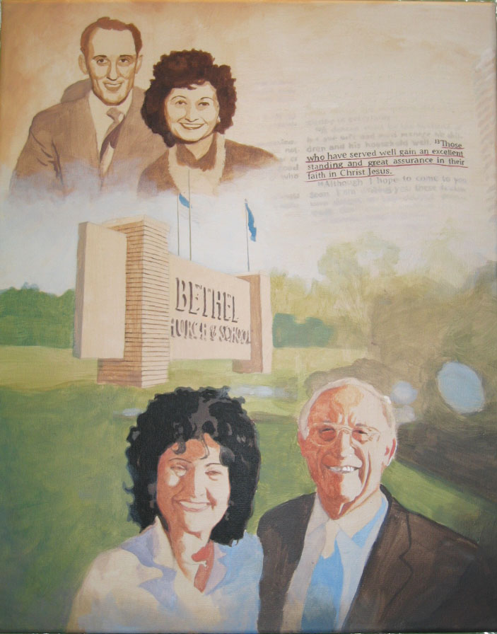
But then as I invest more time into it, I expect that a painting should start “behaving” and looking pretty good, for all the time I put into it. However, that doesn’t always happen. In fact, for me, it usually doesn’t.
Portrait of Pastor & Mrs. Philip Palser, 16 x 20, acrylic on canvas, 2005 by fine artist Matt Philleo, Step 2
Somewhere around these two stages. the painting looked pretty goofy, and it’s about at this point where my wife remarked, “I don’t know if you can pull this one off.” She said that the pastor’s wife looked like some weird “california girl.”
Even though I was tempted for a moment to give up, I thought something along the lines of, “I know what this needs to look like in the end. I’ve got my reference photo next to me. I’ve got some paint and a palette. Sooner or later, it’s going to look like it should and it will turn out alright.”
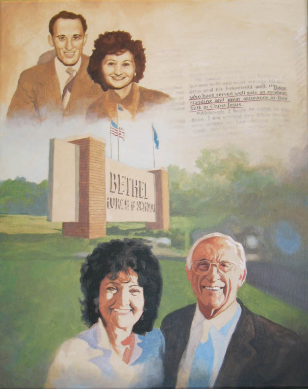
Portrait of Pastor & Mrs. Philip Palser, 16 x 20, acrylic on canvas, 2005 by fine artist Matt Philleo, Step 3
After a few more hours, the painting started to turn the corner. Even though I think I had painted certain areas of the faces a bit too dark, I was able to layer over them with just the right mix of colors to adjust what was off.
When you are establishing values and colors on your faces, sometimes the accuracy you had in your sketch will be thrown off. Capturing these shadows are vital to making a person’s face look like the person you are trying to capture. Since shadows describe the contours and shapes of eyebrow ridges, noses, cheekbones, jawlines, and so many other parts on a human face, it’s important to realize that during the in-between stages, you won’t have an accurate likeness. It’s like a sculptor who has to chisel off many fragments of marble or wood to get the beautiful sculpture that was hiding inside the whole time.
Soon enough, I could see the likenesses taking shape.
That excitement of certain areas of the picture starting to look great then compels you to work even harder to get to the finish line of a signed portrait.
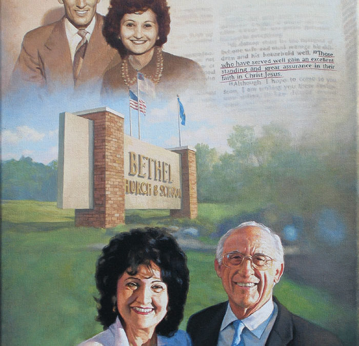
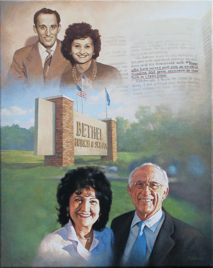
Portrait of Pastor & Mrs. Philip Palser, 16 x 20, acrylic on canvas, 2005 by fine artist Matt Philleo, Step 4
There was still a lot of detail work to do: many nuances to add in the clothing, details in the face and bricks in the church sign. It took a lot of patience, but it paid off. After about 35-40 hours, I had a finished painting!
Portrait of Pastor & Mrs. Philip Palser, 16 x 20, acrylic on canvas, 2005 by fine artist Matt Philleo
I presented this to my pastor and his wife at his 80th birthday party. They loved it. That was 12 years ago, by the way. He is now 92, and still preaches (although not as much as he used to) today!
So again, I want to encourage you: if you are painting a portrait in acrylic, the next time you feel like giving up at a certain part in the process, push past it and keep going. Continually refer back to your reference photo, and paint exactly what you see. If you don’t give up, you will have the confidence knowing that you can finish what you started, and your paintings will never get the best of you. But you will give your paintings the best, and have something excellent to show for your efforts.
I’m writing this post on Good Friday, and this whole idea of finishing what you started, pushing past the difficulty, and seeing what good can come as a result, makes me think of Jesus’ passion. He could have decided as the going got tough–incredibly tough–knowing in advance what He would endure on the cross, to abandon his plan of providing salvation for the world by dying on the cross for our sins.
But instead, he headed for Jerusalem, knowing what would happen to Him there.
In the garden of Gethsemane, when it would have been easier to turn away from the preordained plan of experiencing God’s wrath for sin and even having His relationship with His father broken for a time, he prayed, “Not my will, but yours be done.”
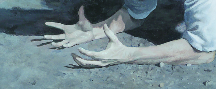
And three days later, we all know…”the rest of the story.”
Portion of “Perfect Servant,” acrylic on canvas, 2002, by Matt Philleo
All this to say, there is great reward for not giving up, both in this life and the next. Happy Easter…and Happy painting!
–Matt
Share Your Thoughts!
If you have any comments or questions about what I wrote, please leave me your feedback below at the very bottom of the page! I will personally get back to you. Can you help me spread the word? Please share this post with your family and friends by using the social media links on the side or at the bottom of this page. Thank you!
Hope you had a great Thanksgiving. I know I did. It was rejuvenating to take a little time off from the studio, and spend it with family. Sometimes as an artist, you feel the crunch of having to create a lot of artwork, and your creative energies get tapped out. Thanksgiving’s a fantastic time to recharge, give thanks to God for all the blessings He’s given, be with family, and of course, eat a wonderful home-cooked meal.
Back to the studio tomorrow.
While teaching art classes lately, I’ve discovered one of the most challenging things for my students to learn is how to shade.
For artists and art appreciators, shading is a mysterious thing. We wonder how to do it, or how others did it.
Shading– the transition from a dark value to a lighter value in a two-dimensional work of art–is one of the most important techniques you can master to make a painting or drawing look realistic.
I’d like to share a video (hosted on YouTube) I created earlier this week about that, with you. This is my first art instructional video–in fact really the first serious video recording I’ve done, since the old days of playing around with a VHS-C camcorder with my buddies after school. We made some pretty crazy movies back then!
Somewhere towards the end of the video–maybe about 2/3 of the way through–is where I really get into it: how to do shading with acrylic and make it look real.
Hope you enjoy this video, and let me know if it helps you in your painting. Let me know, too, how I can improve it in any way, so going forward I can create some videos that are more helpful, or informative for you. Or maybe you don’t paint, but you are interested in the process of acrylic painting. Again, let me know if you’d like to see more stuff like this in the future!
And of course, as I always ask, please share this with your friends! Thanks!
Blessings,
Matt
P.S. I will have the painting featured in the video on display at the art show this Saturday at my studio. (1106 Mondovi Rd, in Eau Claire, 10-4pm)
Share Your Thoughts!
If you have any comments or questions about this post, please leave me your feedback at the very bottom of this page! I will personally get back to you. Can you help me spread the word? Please share this post with your family and friends by using the social media links on the side or below. Thank you!


Recent Comments