
How do you get your portrait paintings to look lifelike?
Here’s a 5-step printable guide to get you on the road to realism.
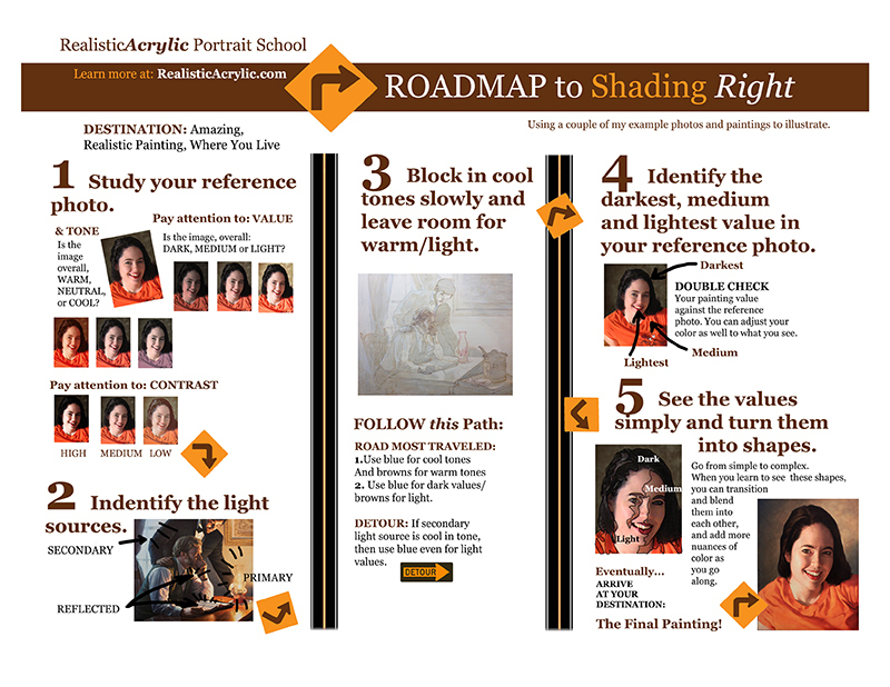
Click here to download the full resolution 8.5″ x 11″ printable file.
It will help get you on the right track in using color and value and correctly, so that your acrylic portrait painting looks lifelike.
All of this is in a standard 8 1/2″ x 11″ printable guide that you can keep for easy reference. Although it will not solve all your painting problems,you’ll be able to use it as an excellent tool to get your painting going in the right direction, or even give you some solid principles to go by if you’re stuck. Let me know what you think of it and how it helps.
Be blessed in your painting adventures and I’ll be in touch!
I’m new to acrylics and would like tips on painting and also the grid system.
Michael, please visit me at my blog exclusively for realistic acrylic portrait painting at: Realistic Acrylic Portrait School. I have a lot of great tips there. Also, sign up for my weekly Art Tips. Thanks!