Is it possible to do portrait painting while you’re away from your home, your usual studio area?
This was something I’ve always wanted to do: create art while camping. And for all the years I’ve gone camping, I’ve never been able to successfully do it.
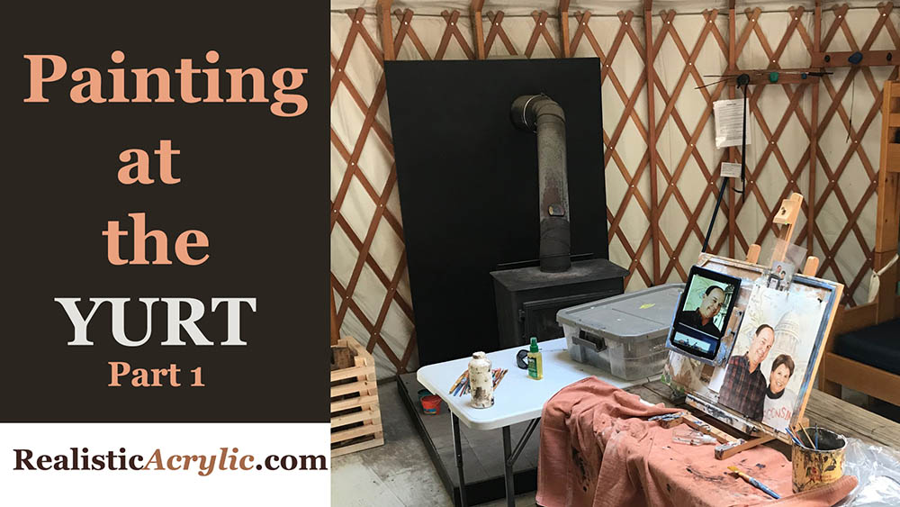
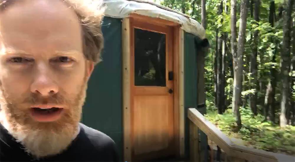
But finally, at the end of June, my brother and I decided to go camping at a rustic yurt up in Cable, WI. Where is that? Let’s just say, it’s “way up north.” 🙂 And what is a yurt? It’s a round tent-like house, a permanent structure made of lattice wood, bound together with steel cable, and covered with fabric. We rented it through Airbnb for two days.
Acrylic portrait artist Matt Philleo ready to paint at a yurt in Cable, Wisconsin
We parked at the bottom of the hill and carried our gear up about a mile. We realized how out of shape we were! I also had my painting supplies: easel, palette, and brushes with me. In the middle of hiking and cooking, we decided to both do a little work: my brother wrote (he’s an author) and I painted.
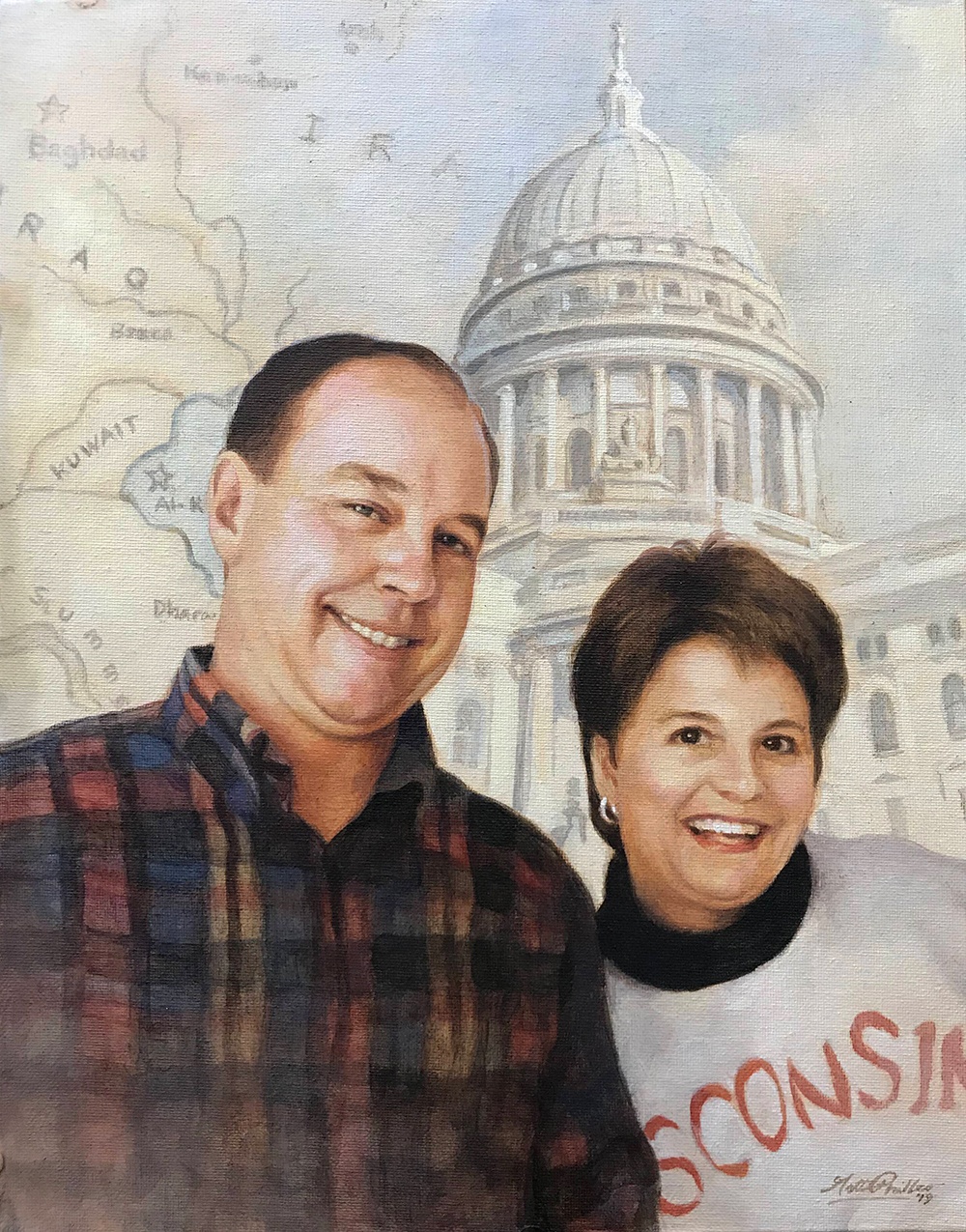
I know. You’re probably thinking I should have painted the scenery up there, and yes, it was beautiful. But I had a commissioned portrait from a photo to get done: a painting of a veteran that served in the gulf war. And I love painting people, so it hardly seemed like work.
After bacon, eggs, and oatmeal for breakfast, it was time for painting.
Here is a video showing the beginning part of the process. In this video, I am basically blocking in the values with just raw umber dark and ultramarine blue. Of course, it’s all thinned out and made translucent with matte medium.
And then, here’s the next video in the process. Here I’m adding some color with burnt sienna, alizarine crimson and a few other colors. We’re starting to build up some skin tones. Also working on the flannel shirt. It takes a lot of layers to get it dark enough to look realistic!
After lunch, we hiked, and then came back and did more work: refining the shadows and making sure the likeness is accurate.
Sometimes your sketch just won’t cut it. It will get you about 80% of the way there, and you do the remaining 20% with paint. As you apply the paint, you can change the shape of the nose, the distance between the eyelids, lengthen the smile, etc., to adjust whatever might have been off during your sketch.
Of course, there is more to go on this painting. I’ll share the rest with you soon.
UPDATE: Here is the final video of this portrait, painted at my regular studio…
I really enjoyed painting this for the client, putting all the elements–the map of Iraq, the capitol building, and the people together into one cohesive portrait that I hope will be a cherished keepsake for the family for years to come.
I wasn’t able to finish it at the yurt, but I put in several hours. So, not only did I get to spend some great quality time with my brother, but I got to do some enjoyable work as well. After the big move, I finally feel like I’m getting into a regular groove of painting and posting tutorials. Thanks so much for your patience.
I hope this painting has encouraged you. If you would like your own memory captured uniquely with a custom portrait, just let me know. Call me at 715-864-9323, or email: matt@mattphilleo.com
All the best,
P.S. Did you find this post helpful or encouraging? If so, send it on ahead! Let others know with the share buttons below. I’d love to hear your comments. Thank you so much! Also, do you have a question on acrylic portrait painting you’d like answered? Let me know, and I’d be happy to help!
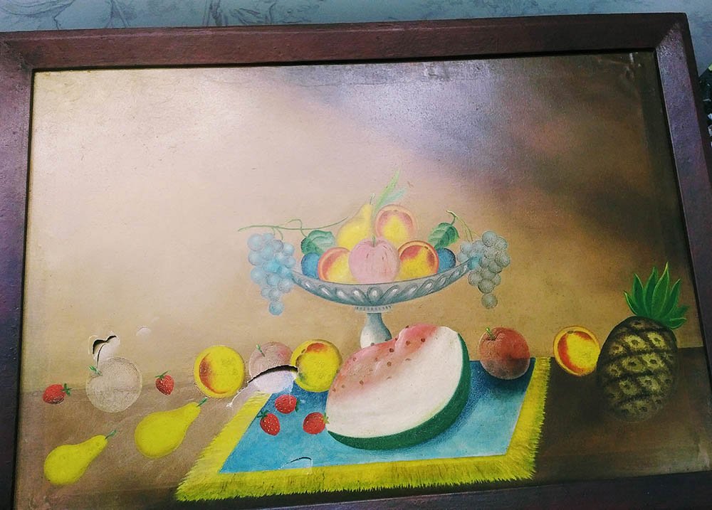
What do you do when your son stabs your painting with a spoon?
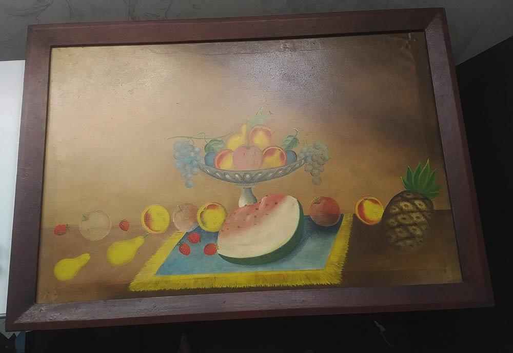
This is the question I had to answer when a customer asked me if I could fix this painting.
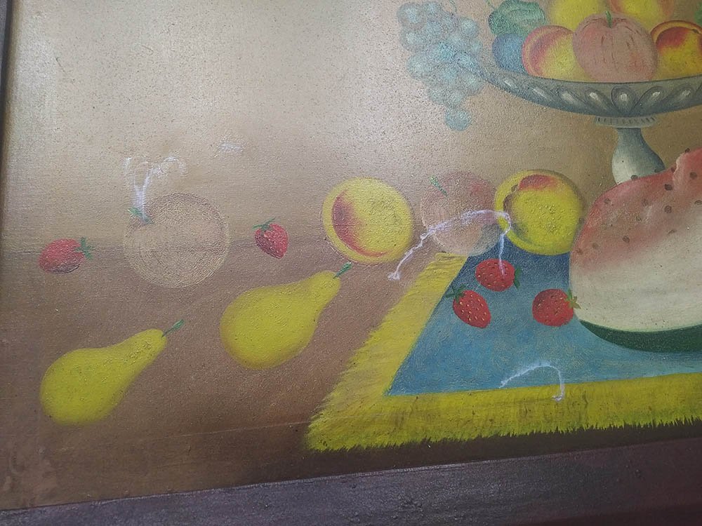
It was a special painting in his family, a collectible, and his then 2-year old son got a little excited one day with the silverware, adding a new dimension to the surface of the picture.
“I haven’t done anything like this before, ” I more or less told the customer when he asked if this kind of repair was possible. “But let’s give it a try.”
And so I laid the canvas out on a table and assessed the damage. There were several punctures in the canvas, so it wasn’t going to be easy.
I researched on how to repair paintings, and many websites suggested using a patch, but that it might be possible to see it from the other side, so you have to be careful with a repair like that.
What do you use for a patch?
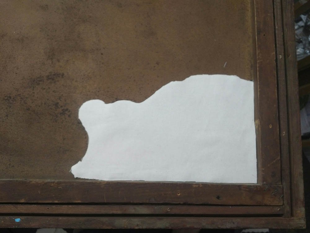
I had some canvas lying around, so I figured it would be good to use the same material.
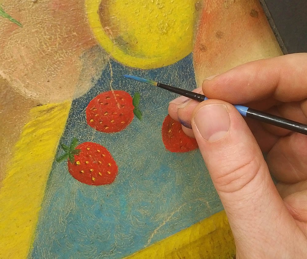
And then just to make sure it didn’t leave an impression on the other side years later, I cut the fabric to match the shape of the painting’s contours–in this case fruit in the still life.
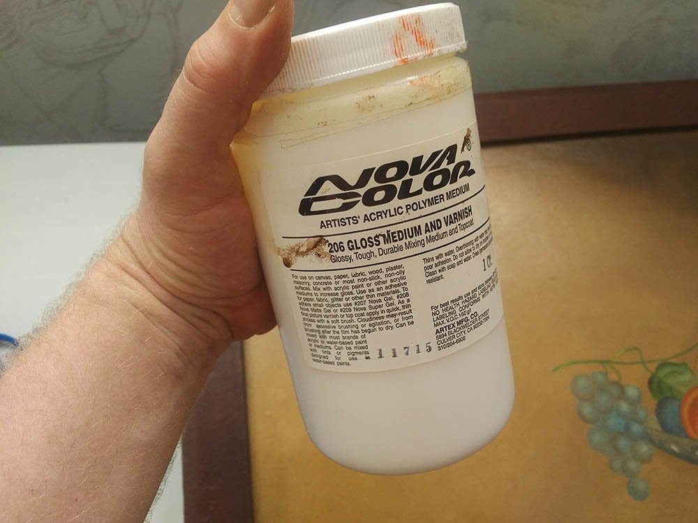
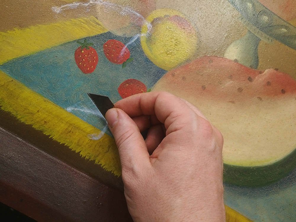
I applied gloss medium (clear acrylic without pigment that also can be used as an adhesive) to the patch and praying a quick prayer, weighted it down. This step is critical. If I misaligned the patch or caused the holes in the canvas to buckle, after the adhesive dries, the damage would be permanent.
30 minutes later I took the weight off and inspected the other side. How did it look? Excellent. The tears were lined up almost perfectly.
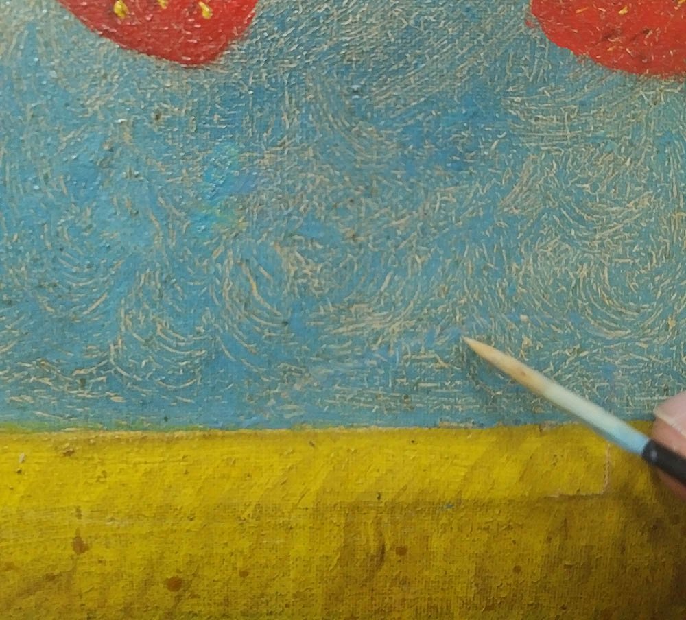
But this is where the real work began. I had to fill the cracks in. The tears still left very noticeable crevices in the surface of the canvas. It had to be filled in.
So I thought, let’s use some acrylic medium and fill in the holes like wall spackling. It does work, I discovered, but it takes several layers to do the job. I applied each layer with a brush and then began to scrape over it with a flat-edged blade.
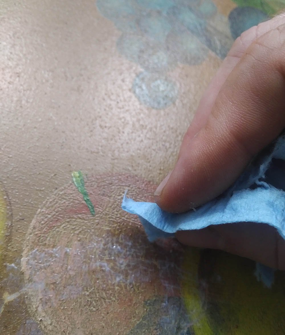
Eventually, the surface was flat. I used a piece of shop towel to stipple the last layer–helping it to match the texture of the canvas, which is slightly putted.
Fantastic.
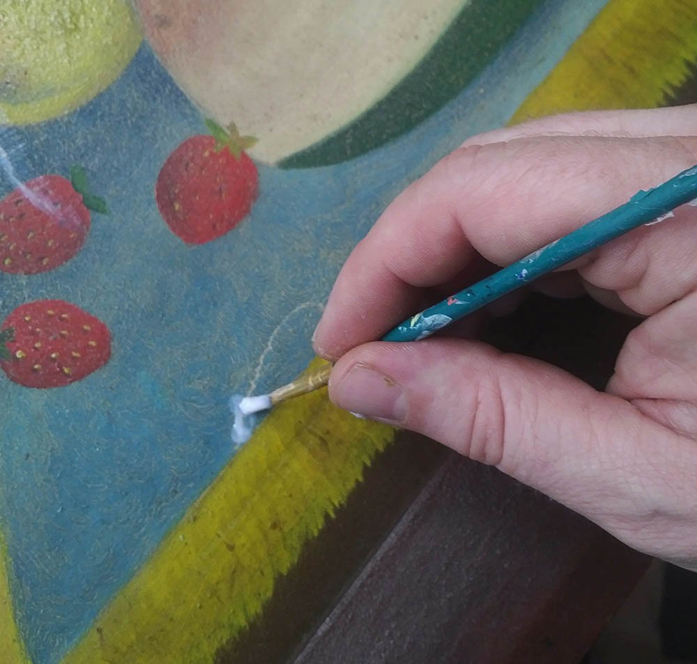
Now, with the surface matching perfectly it was just a matter of matching the color of the painting to fill in the little lines and cracks left by the tear.
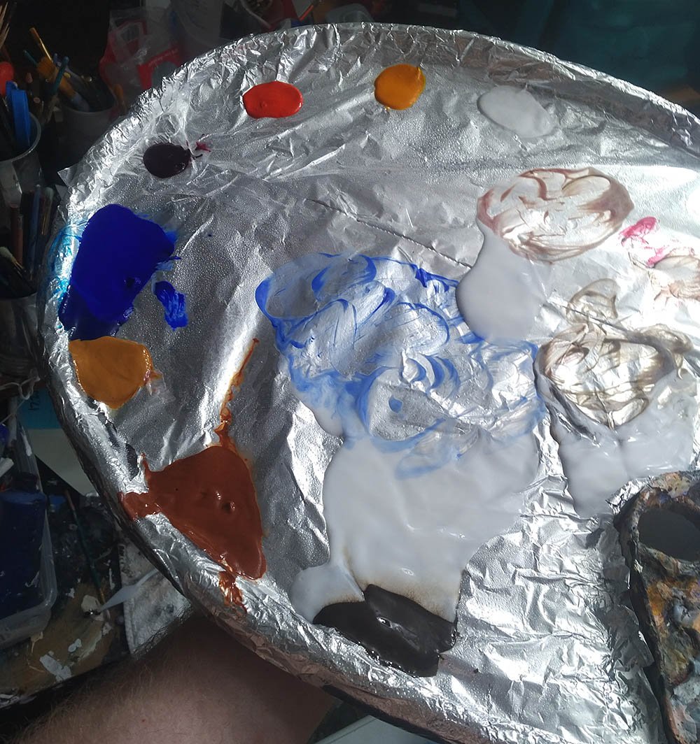
Matching each color up by eye, I filled the areas in. I also tried to match the sheen by mixing matte (flat) and gloss medium together and cover over the top.
When I was all done it was really hard to tell that anything even happened to the painting. I had trouble even seeing some of my repaired areas. I gave it to the client and he was amazed too. I thank God. It was a profitable project for me and it really blessed the customer to have their painting back and be able to hang it up on the wall.
I don’t know. Maybe they’ll hang it a little bit higher this time. 🙂
Thanks for reading and have a blessed day,
If you have any comments or questions about what I wrote, please leave me your feedback below! I will personally get back to you. Can you help me spread the word? Please share this post with your family and friends by using the social media links on the side or below. Thank you!
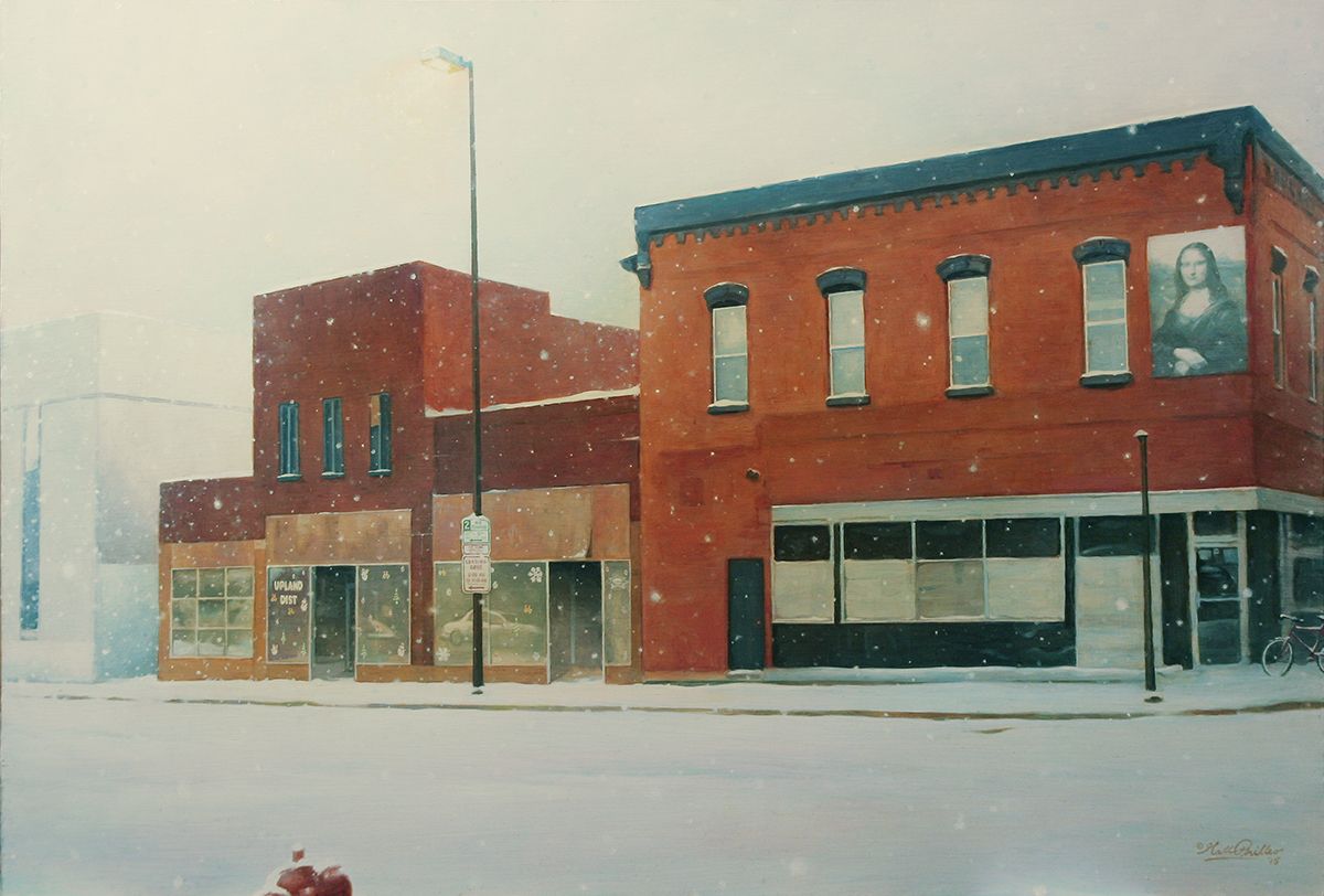
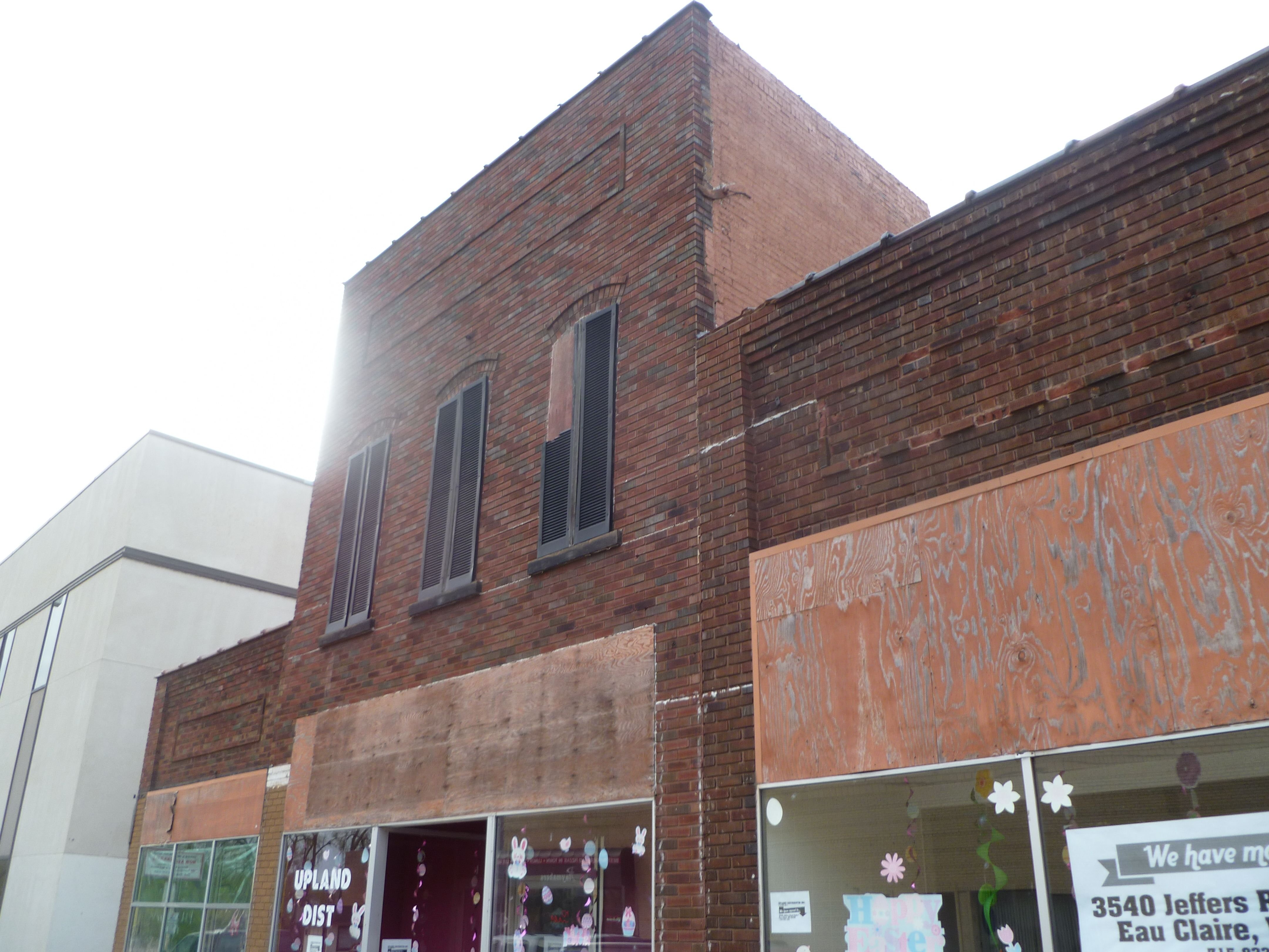
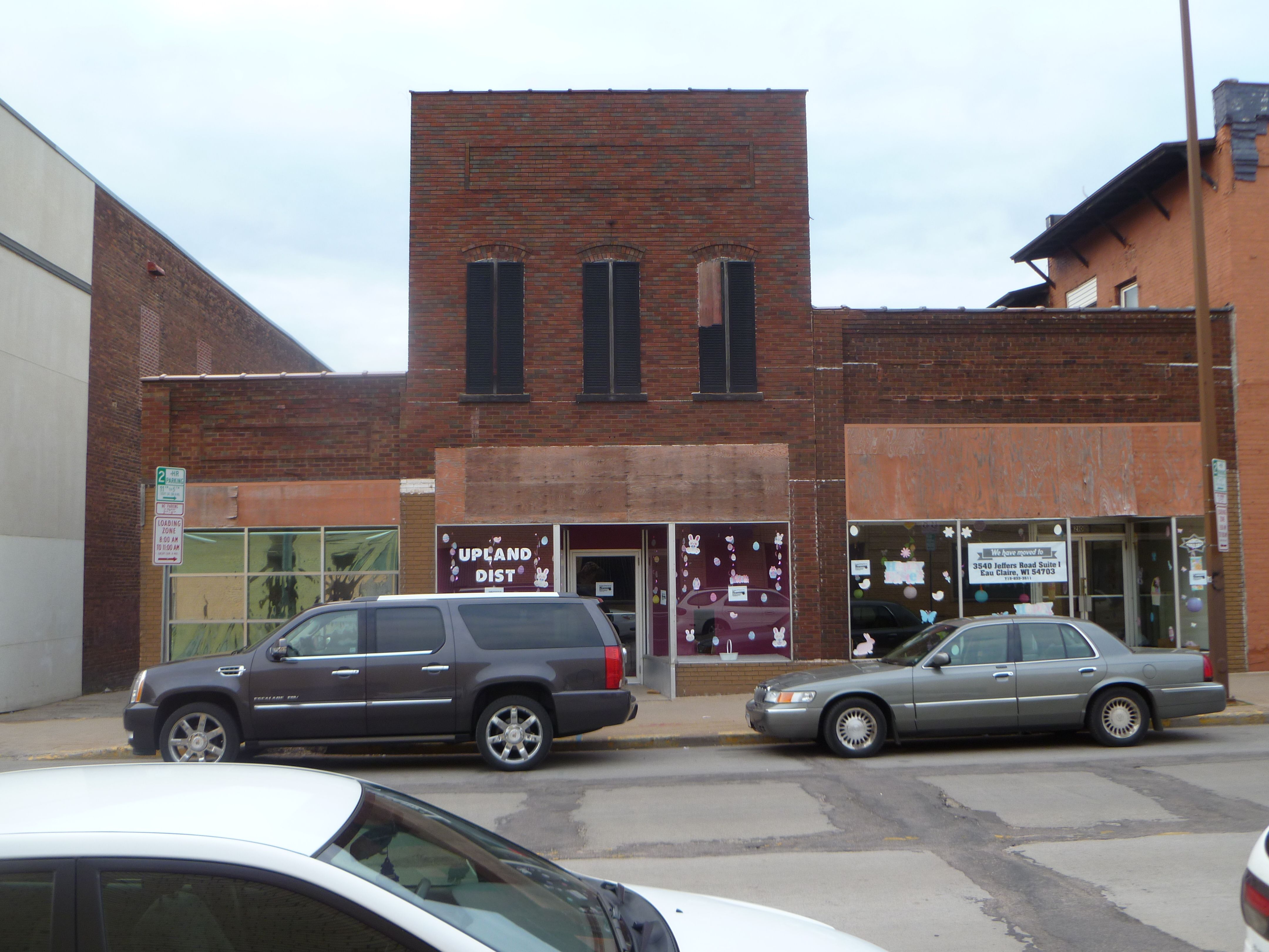
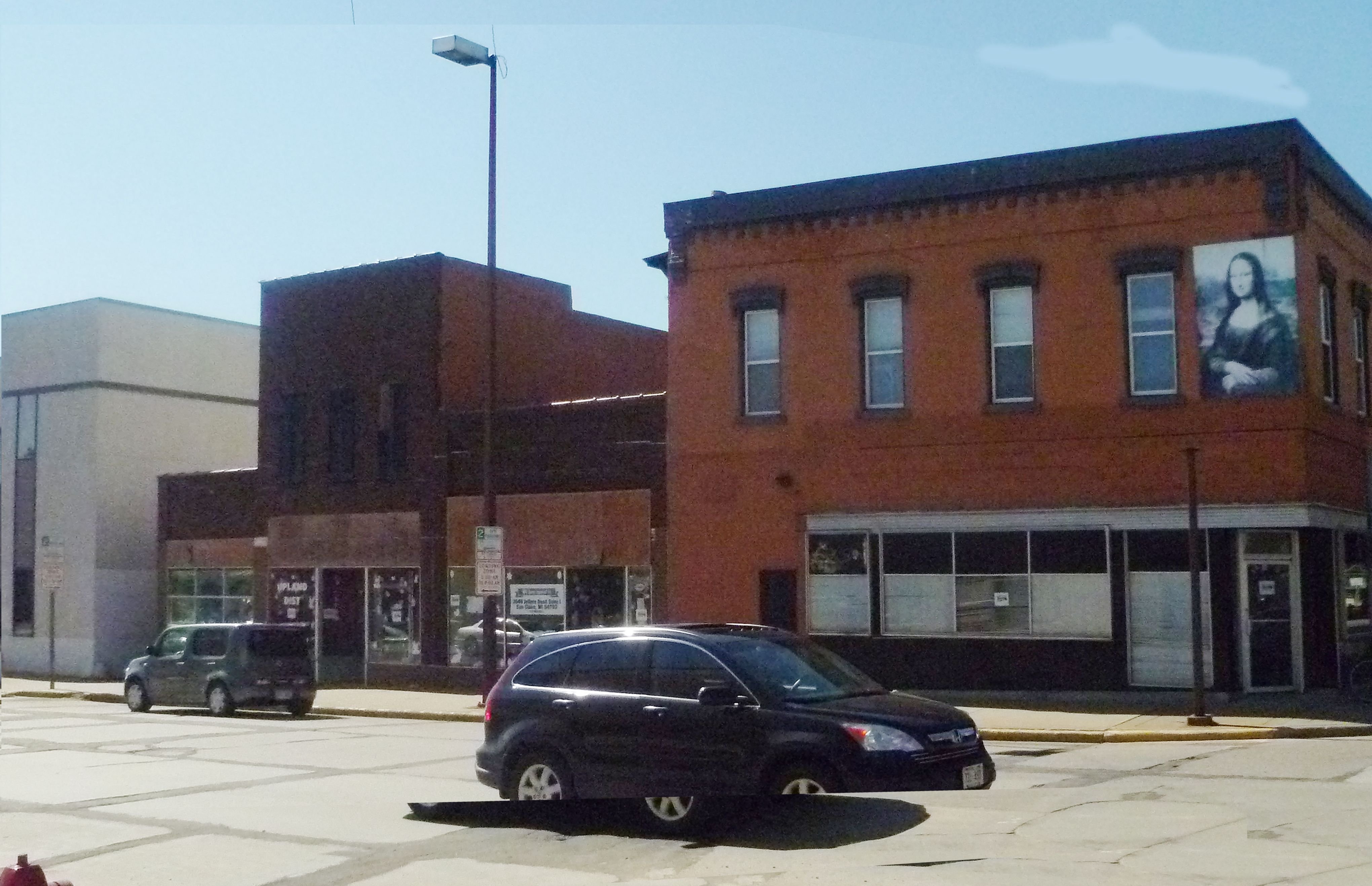
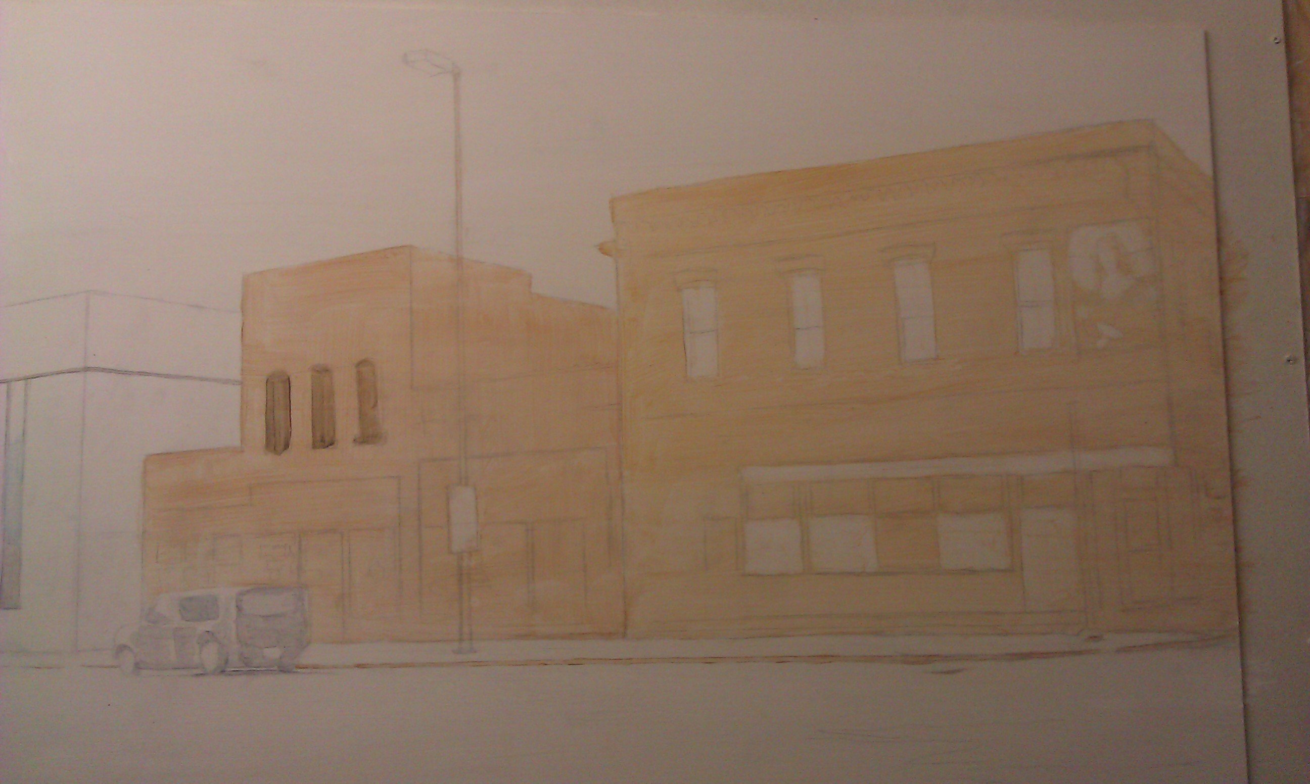
Here is a painting I did of a building in my town that is now no longer there.
I title this “The Original Upland,” (24″ x 30″, acrylic on hardboard) because it used to be the home of Upland Distributing, Inc. a vacuum and filtration sales and service company where I used to work years ago, as a traveling service technician.
While I worked there I built up a relationship with my boss, the owner.
Since I knew the building was slated to be demolished soon, and the owner would have to move his business into another building after being there for nearly 20 years, I thought a painting would be an encouragement to him. It would help keep the memories alive.
It was something I felt God wanted me to do to bless him, and I waited for a while, but when I knew that demolition was imminent, I got out my camera and took some pictures.
Maybe I’m a newbie at camera lenses, or I just tried to do the best I could with my small digital camera, but backed up by the buildings on the other side of the street, I couldn’t get the angle I wanted for image.
So I took a few images and “frankensteined” them together on Photoshop, using the warp and perspective tool to change the angle of the building to match the photos seamed together.
Never mind the cut-up-half floating car!Thatwon’t be in the actual painting!
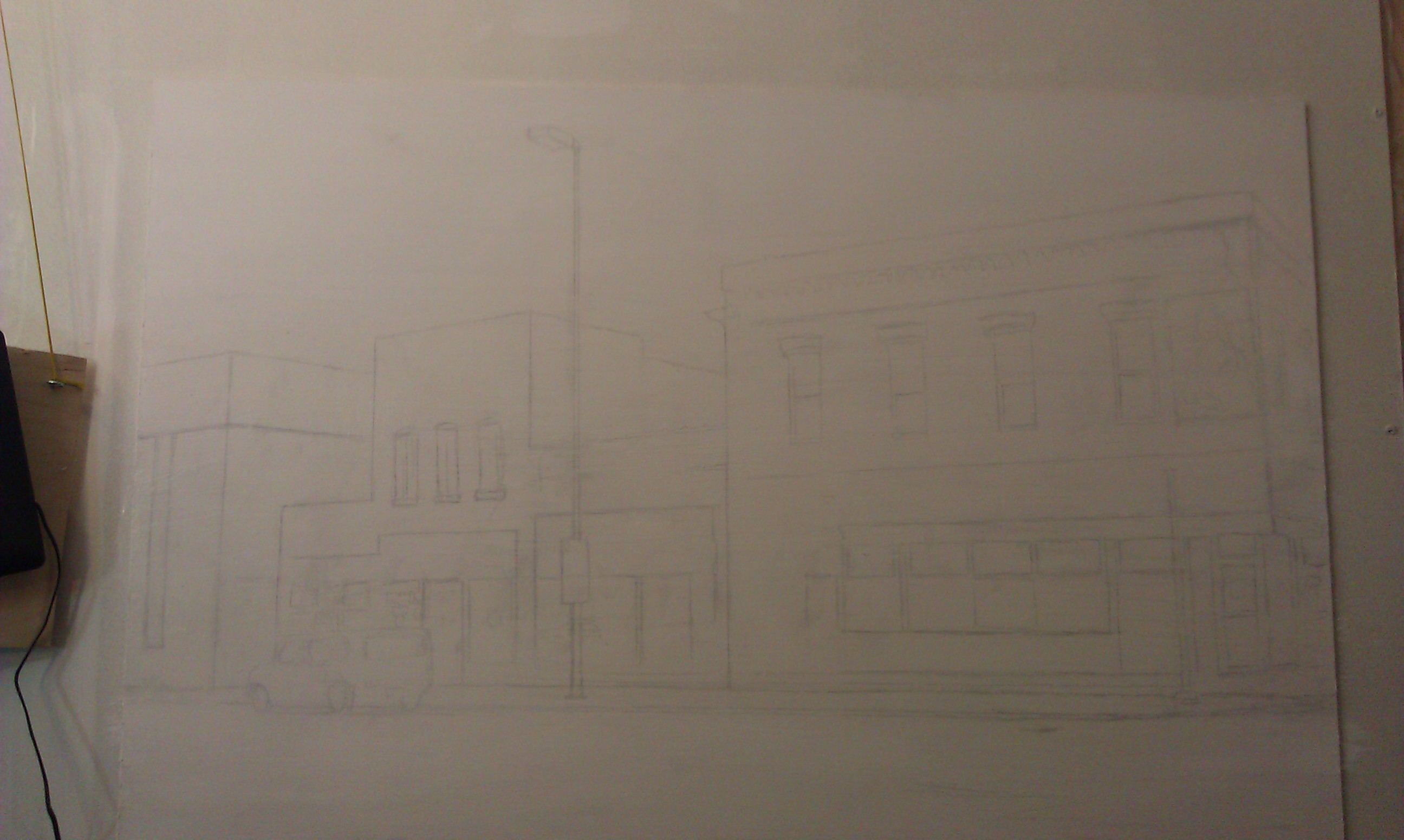
With this layout, I now had an image to paint! Here’s the step-by-step process…
Step 1: The Sketch
I made this very simple–just some lines, using a projector and a ruler to double check the angles. A projector can really distort your image, so you’ll always have to double check using your proportional skills and a ruler for straight lines!
After getting the sketch done, it was time to fill in with paint. I use acrylic mixed with matte medium to thin it out and make glazes. Everything starts out very light.
I used these colors:
Raw umber dark
Burnt sienna
Alizarine crimson
Phthalo blue
Raw sienna
Yellow ochre
Indian yellow
Titanium white
Ivory black
Step 2: The Underpainting
In this step I block in the initial color of the building. The goal is to create a lot of contrast right away and make the orangish-brick colored building stand out against the pale white background of the snow and sky. Using burnt sienna and raw sienna with a heavy amount of clear acrylic medium to dilute it, I fill in the areas rapidly with a 1″ flat brush.
It’s the perfect size: large enough to cover the area quickly, but small enough to “cut in” around windows and trim. Sounds like house painting!
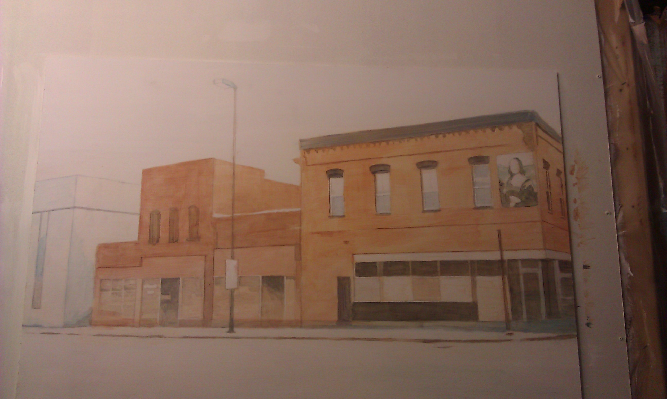
Step 3: Defining the Darkest Values
Unless you get a sense for the darkest values within a picture, you’ll never know how dark to go with the medium and light values. So in this step, I darken in the window ornamentation, and the molding on the top of the building. I use a mixture of blue and brown, and I don’t want it to be too dark.
Why?
Because I’m trying to create the look of snow falling. You’ll notice as you look outside on a snowy day (I did on my drive to the studio) that when fine snow flakes are in the air, you don’t see just a lot of white specks. But the colors on everything–especially objects in the distance are muted.
Did you notice something? Or rather something that’s missing? I took out the vehicle that I originally had in front of the building. I decided that I wanted to show more of the details of the large glass windows, and that vehicle was getting in the way.
But to make the composition more interesting, as you’ll see, I add in a snow-covered fire hydrant. It also reiterates the reddish color of the building.
Step 4: Enriching the Colors
This is where it gets fun. All the colors get enriched. I add several layers of burnt sienna and raw sienna to the building, making some areas darker than others. I want to create the look of old brick that is maybe a little dirty in some spots, and catches the light a little bit in areas that are angled towards the sky.
Also, I really add in some details to the Mona Lisa image on the building. That’s a trademark of several buildings in downtown Eau Claire. But in this case, the image has faded after several years, so I paint it with bluish colors, just as I see in my reference photo.
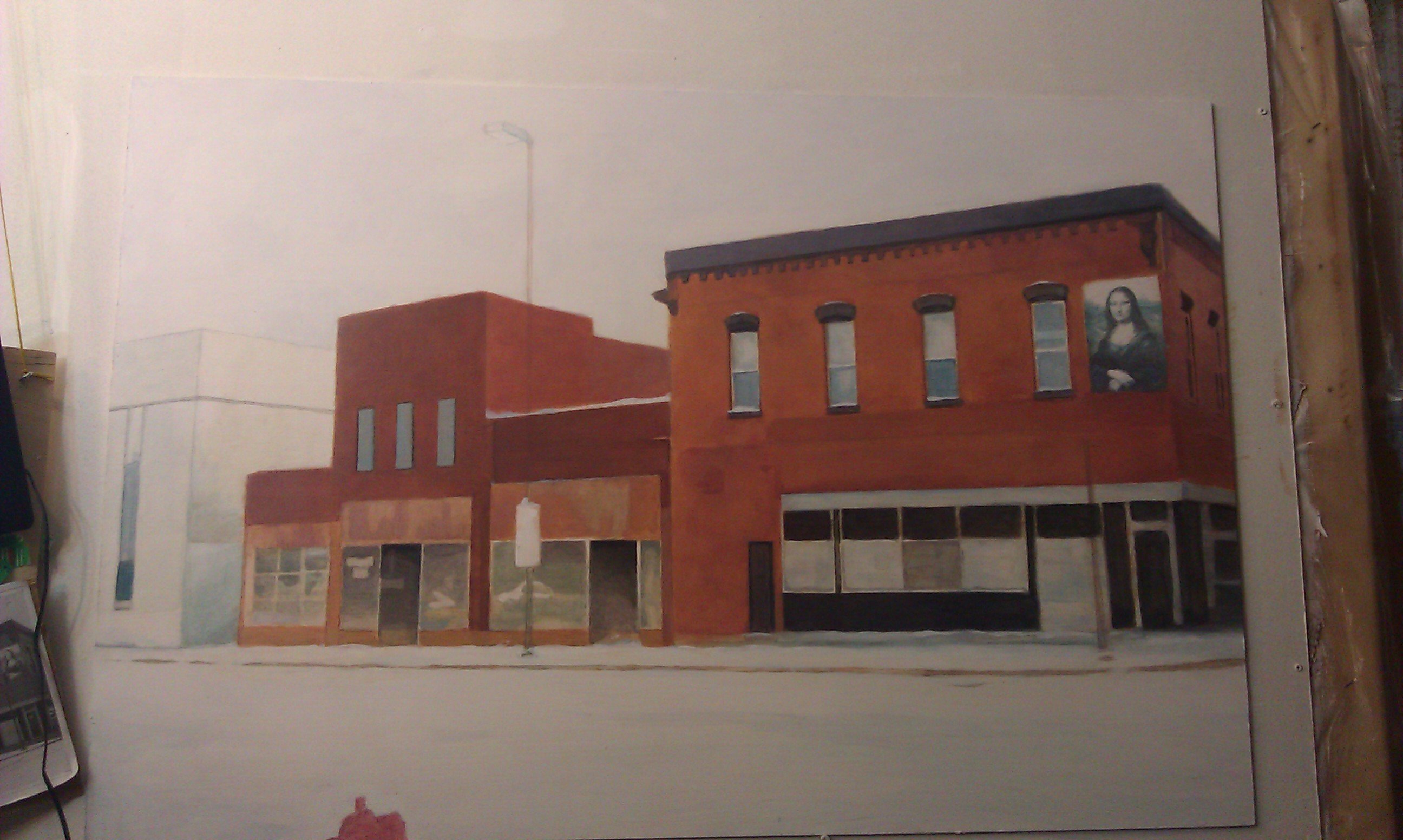
Step 5: The Final Touches
Now the painting is very close to being done. But the final effects really enhance the overall presentation. I add in a lot of snowflakes of various sizes to create that three-dimensional look of some being closer to your line of vision than others.
Next, I make it look as if there’s Christmas decorations on the business’ front window. And last but not least, the details of the 2-Hour Parking sign. That was a very important detail to include, because the business owner recalls how he had to move his vehicle several times to avoid getting a ticket.
All part of the memories!
Finally, just to add some charm: a bicycle, again covered by snow. We have people in our city that bike year-round. I should know. I’m one of them! I made the bike facing towards the painting, intentionally to lead your eye back into the composition.
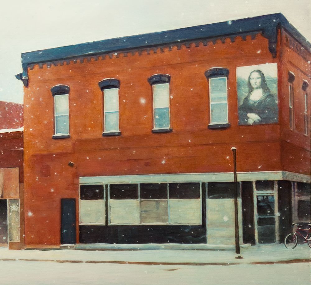
Now, here are a few detail images so you can see it a bit closer up.
When the painting was done, I gave this to my old boss as a gift, which he now proudly hangs in his new office!
I figured I’d share this painting with you since we are still in the gift giving season. And also in much of the world, that charming season of fresh white snow covering the old memories of the year gone by, symbolically cleansing and preparing a way for the bright promises of a new year!
Be blessed,
Share Your Thoughts!
If you have any comments or questions about what I wrote, please leave me your feedback below! I will personally get back to you. Can you help me spread the word? Please share this post with your family and friends by using the social media links on the side or below. Thank you!
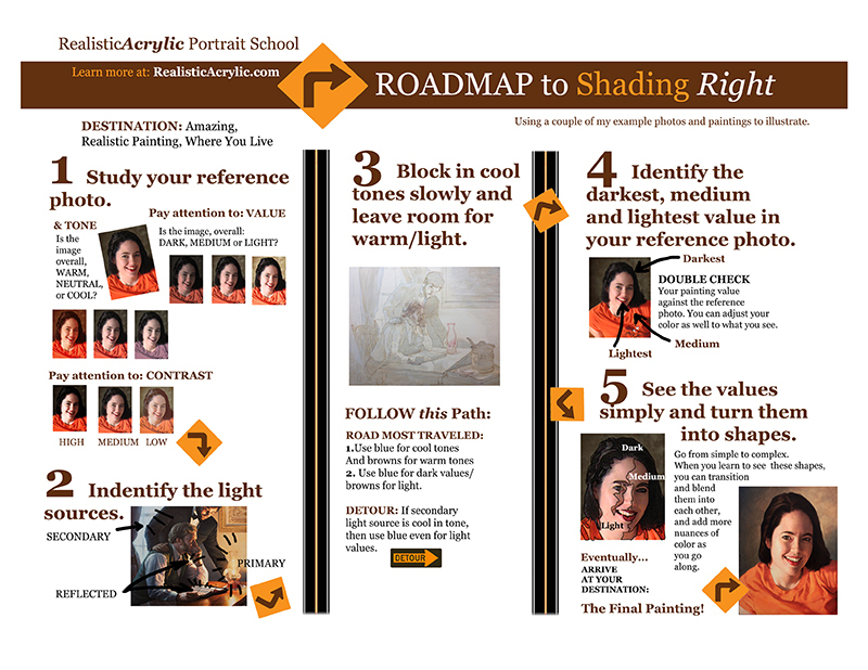
It will help get you on the right track in using color and value and correctly, so that your acrylic portrait painting looks lifelike.
All of this is in a standard 8 1/2″ x 11″ printable guide that you can keep for easy reference. Although it will not solve all your painting problems,you’ll be able to use it as an excellent tool to get your painting going in the right direction, or even give you some solid principles to go by if you’re stuck. Let me know what you think of it and how it helps.
Be blessed in your painting adventures and I’ll be in touch!
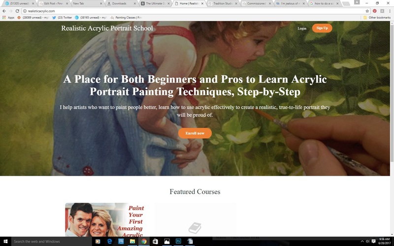
1. The first thing you need to do is login into the Realistic Acrylic Portrait School
At this screen, click the “Login” text in the upper right. (Not the “sign up” button, but the one next to it)
2. Enter your information (email address and password you created.)
Click “Log In”
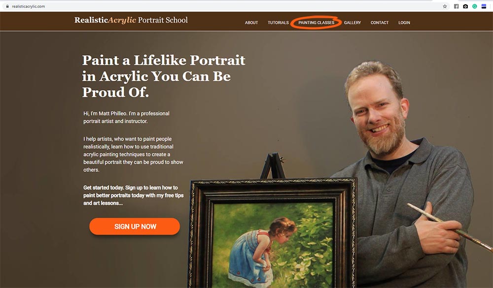
3. After logging in, select, the “Paint Your First Amazing Acrylic Portrait” course on the left (if this is the course you want. Most students start with this one or go with the All-Access Membership.)
4. It will take you to this screen. Click the “Enroll in Course” button.
5. Then, select your payment plan. You can pay in full for $97 USD or you can do a three-month payment plan, allowing you to get started for $39 USD today. But you will save $20 by paying in full!
After selecting your payment plan, click the “Enroll in Course” button.
6. Finally, enter your credit card or Paypal information and you can make payment securely online.
7. Click “Verify Payment.” Then finish the step, and confirm your purchase of the course, and you will be set! You will then be able to login like you did in step 1 and 2 and this time you will have full access to the course.
There is no time limit once you buy the course. You can use it as long as you wish.
Hope this helps… Look forward to seeing you inside the course!
It’s amazing the things you have to do sometimes to get a painting to look realistic.
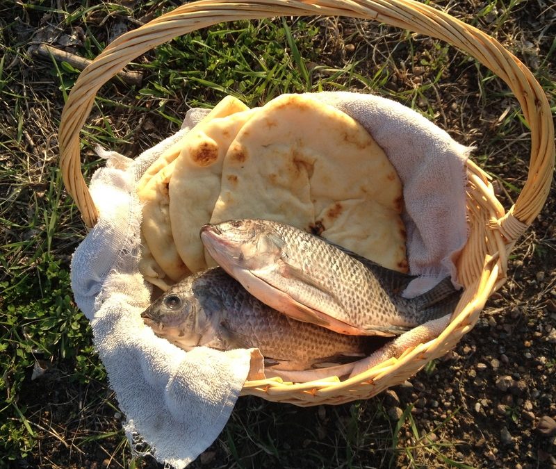
I’ve been commissioned to do a painting of the five loaves and two fishes for a book cover illustration, a commentary on the book of Mark in the New Testament. I didn’t want to copy a stock photo (illegal) but I didn’t want to just make it up (not very realistic)
So I bought some fish, some flatbread and a basket. Took the pics just as the sun was setting. Then I cooked the fish tonight and ate it with the bread. Best fish I’ve had in a long time! 🙂
Here are a few pics that I took…
“Loaves and Fishes Basket” photo 2017 by Matt Philleo
“Loaves and Fishes Basket” 2 photo 2017 by Matt Philleo
Even though this is not my usual subject matter–portraits–it’s good to do a still life once in a while to keep up with your color, shape, and value rendering skills. Many of you have seen this painting on Facebook already, but I wanted to get this posted to my blog.


Recent Comments