
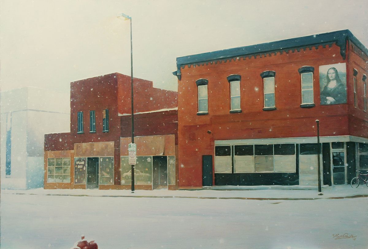
Here is a painting I did of a building in my town that is now no longer there.
I title this “The Original Upland,” (24″ x 30″, acrylic on hardboard) because it used to be the home of Upland Distributing, Inc. a vacuum and filtration sales and service company where I used to work years ago, as a traveling service technician.
While I worked there I built up a relationship with my boss, the owner.
Since I knew the building was slated to be demolished soon, and the owner would have to move his business into another building after being there for nearly 20 years, I thought a painting would be an encouragement to him. It would help keep the memories alive.
It was something I felt God wanted me to do to bless him, and I waited for a while, but when I knew that demolition was imminent, I got out my camera and took some pictures.
Maybe I’m a newbie at camera lenses, or I just tried to do the best I could with my small digital camera, but backed up by the buildings on the other side of the street, I couldn’t get the angle I wanted for image.
So I took a few images and “frankensteined” them together on Photoshop, using the warp and perspective tool to change the angle of the building to match the photos seamed together.
Never mind the cut-up-half floating car! That won’t be in the actual painting!
With this layout, I now had an image to paint! Here’s the step-by-step process…
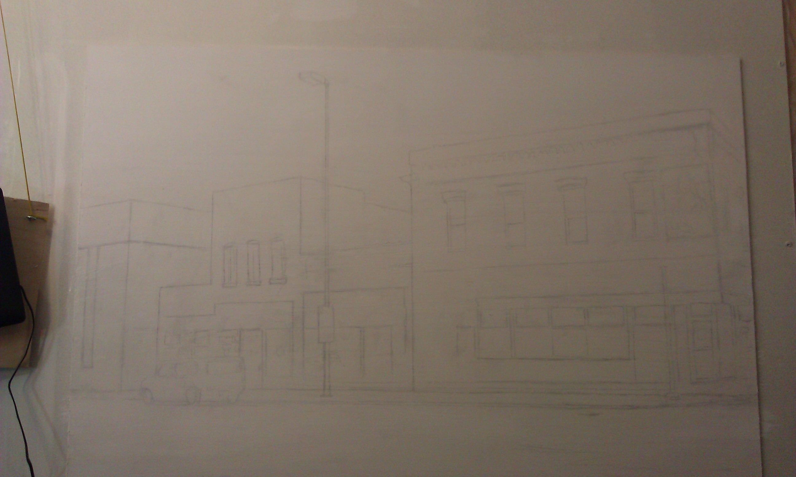
Step 1: The Sketch
I made this very simple–just some lines, using a projector and a ruler to double check the angles. A projector can really distort your image, so you’ll always have to double check using your proportional skills and a ruler for straight lines!
After getting the sketch done, it was time to fill in with paint. I use acrylic mixed with matte medium to thin it out and make glazes. Everything starts out very light.
I used these colors:
Raw umber dark
Burnt sienna
Alizarine crimson
Phthalo blue
Raw sienna
Yellow ochre
Indian yellow
Titanium white
Ivory black
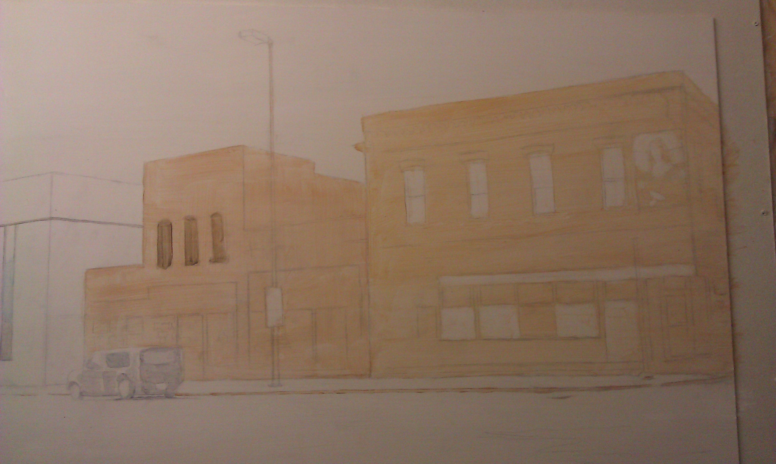
Step 2: The Underpainting
In this step I block in the initial color of the building. The goal is to create a lot of contrast right away and make the orangish-brick colored building stand out against the pale white background of the snow and sky. Using burnt sienna and raw sienna with a heavy amount of clear acrylic medium to dilute it, I fill in the areas rapidly with a 1″ flat brush.
It’s the perfect size: large enough to cover the area quickly, but small enough to “cut in” around windows and trim. Sounds like house painting!
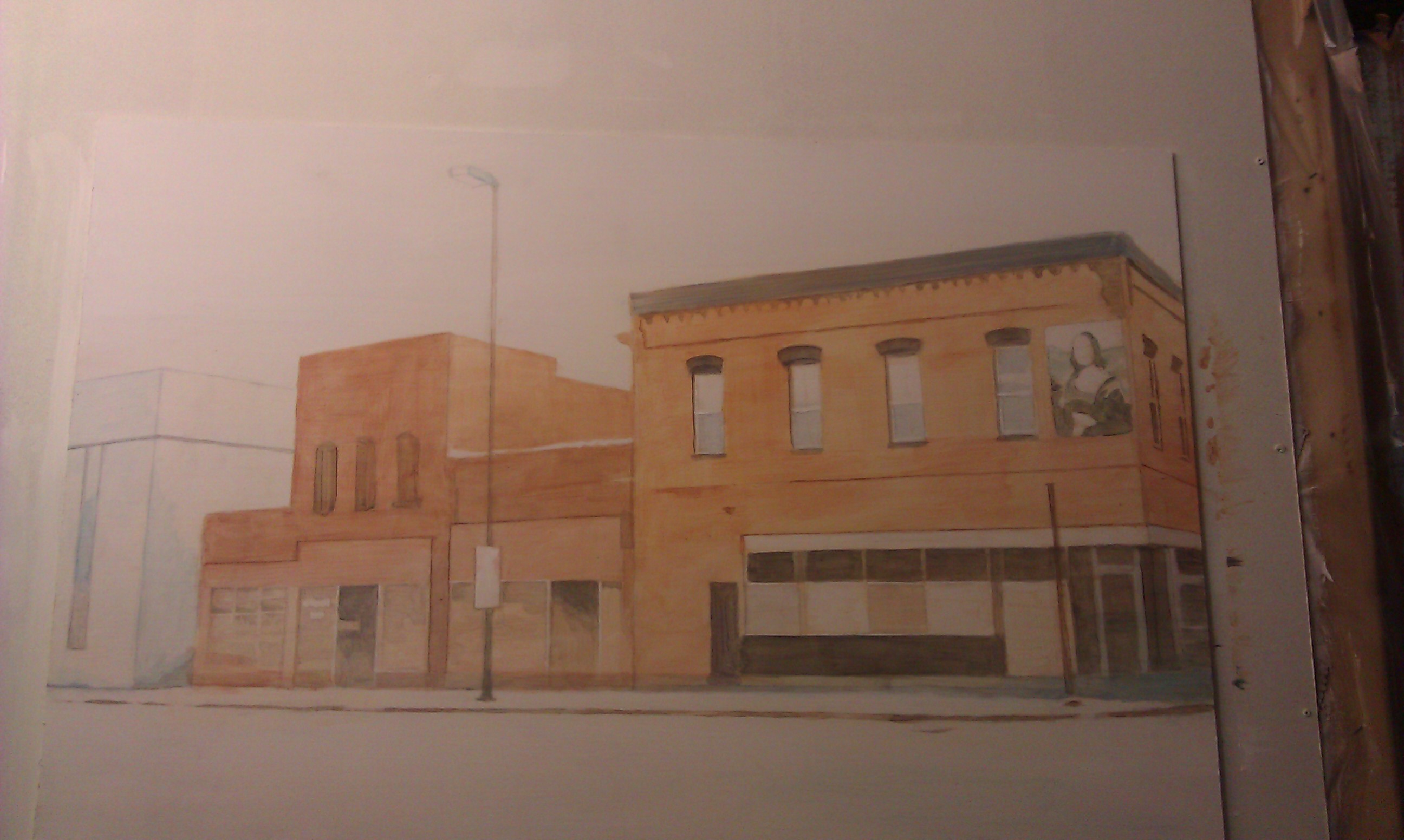
Step 3: Defining the Darkest Values
Unless you get a sense for the darkest values within a picture, you’ll never know how dark to go with the medium and light values. So in this step, I darken in the window ornamentation, and the molding on the top of the building. I use a mixture of blue and brown, and I don’t want it to be too dark.
Why?
Because I’m trying to create the look of snow falling. You’ll notice as you look outside on a snowy day (I did on my drive to the studio) that when fine snow flakes are in the air, you don’t see just a lot of white specks. But the colors on everything–especially objects in the distance are muted.
Did you notice something? Or rather something that’s missing? I took out the vehicle that I originally had in front of the building. I decided that I wanted to show more of the details of the large glass windows, and that vehicle was getting in the way.
But to make the composition more interesting, as you’ll see, I add in a snow-covered fire hydrant. It also reiterates the reddish color of the building.
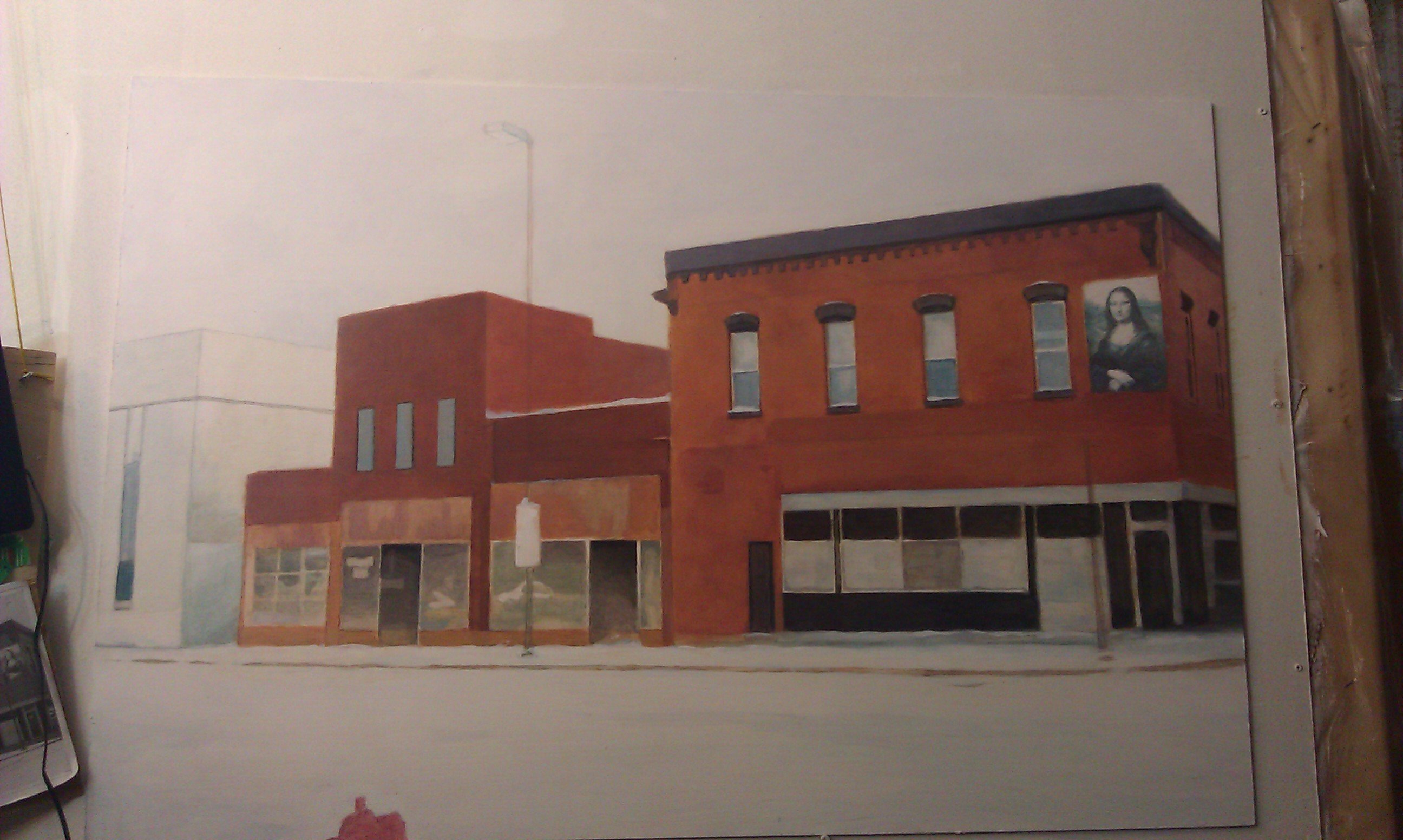
Step 4: Enriching the Colors
This is where it gets fun. All the colors get enriched. I add several layers of burnt sienna and raw sienna to the building, making some areas darker than others. I want to create the look of old brick that is maybe a little dirty in some spots, and catches the light a little bit in areas that are angled towards the sky.
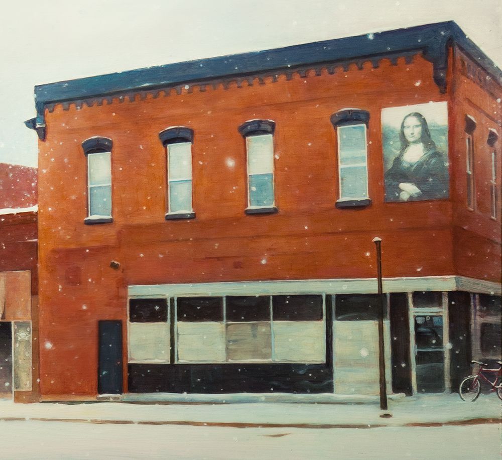
Also, I really add in some details to the Mona Lisa image on the building. That’s a trademark of several buildings in downtown Eau Claire. But in this case, the image has faded after several years, so I paint it with bluish colors, just as I see in my reference photo.
Step 5: The Final Touches
Now the painting is very close to being done. But the final effects really enhance the overall presentation. I add in a lot of snowflakes of various sizes to create that three-dimensional look of some being closer to your line of vision than others.
Next, I make it look as if there’s Christmas decorations on the business’ front window. And last but not least, the details of the 2-Hour Parking sign. That was a very important detail to include, because the business owner recalls how he had to move his vehicle several times to avoid getting a ticket.
All part of the memories!
Finally, just to add some charm: a bicycle, again covered by snow. We have people in our city that bike year-round. I should know. I’m one of them! I made the bike facing towards the painting, intentionally to lead your eye back into the composition.
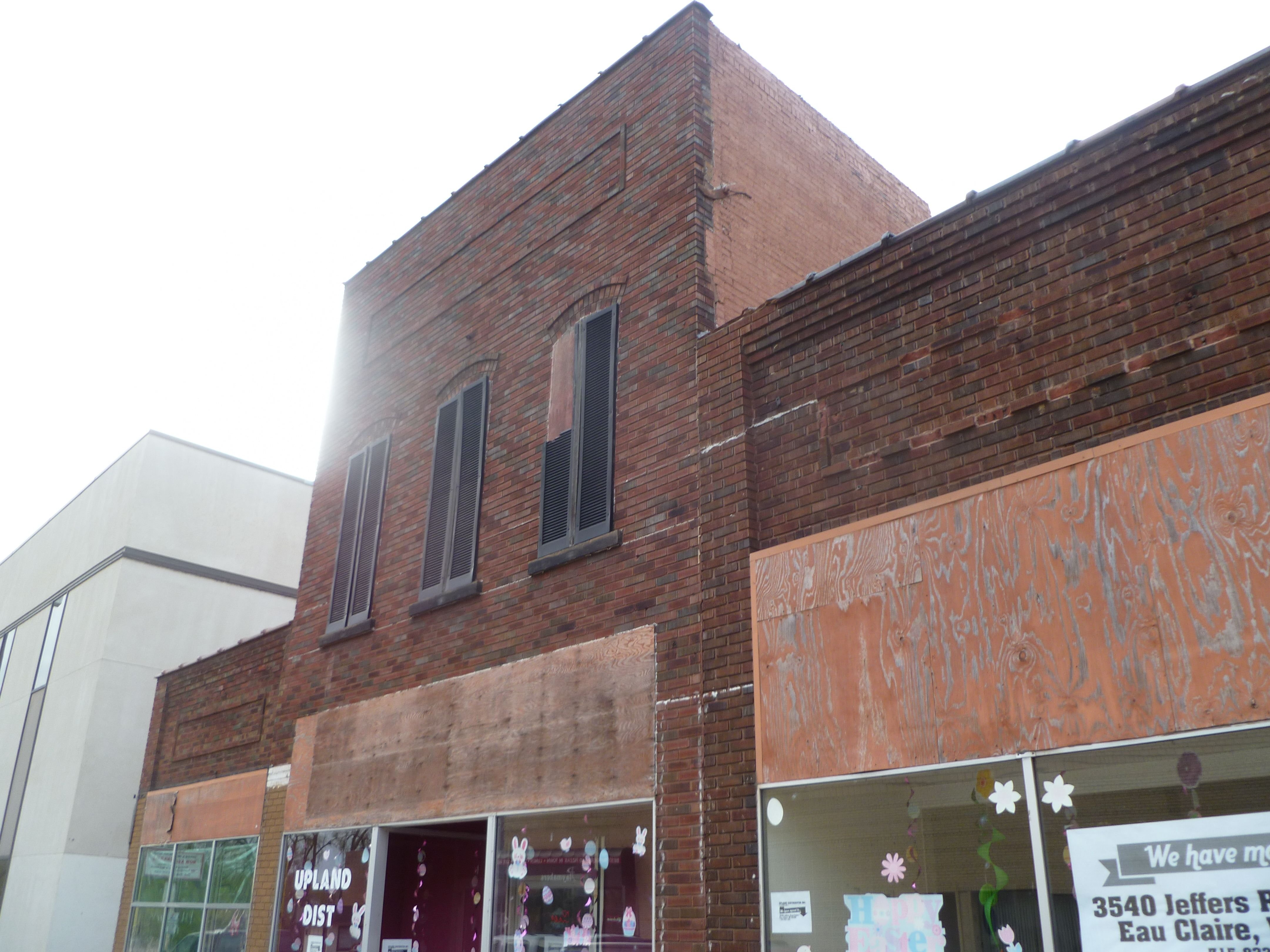
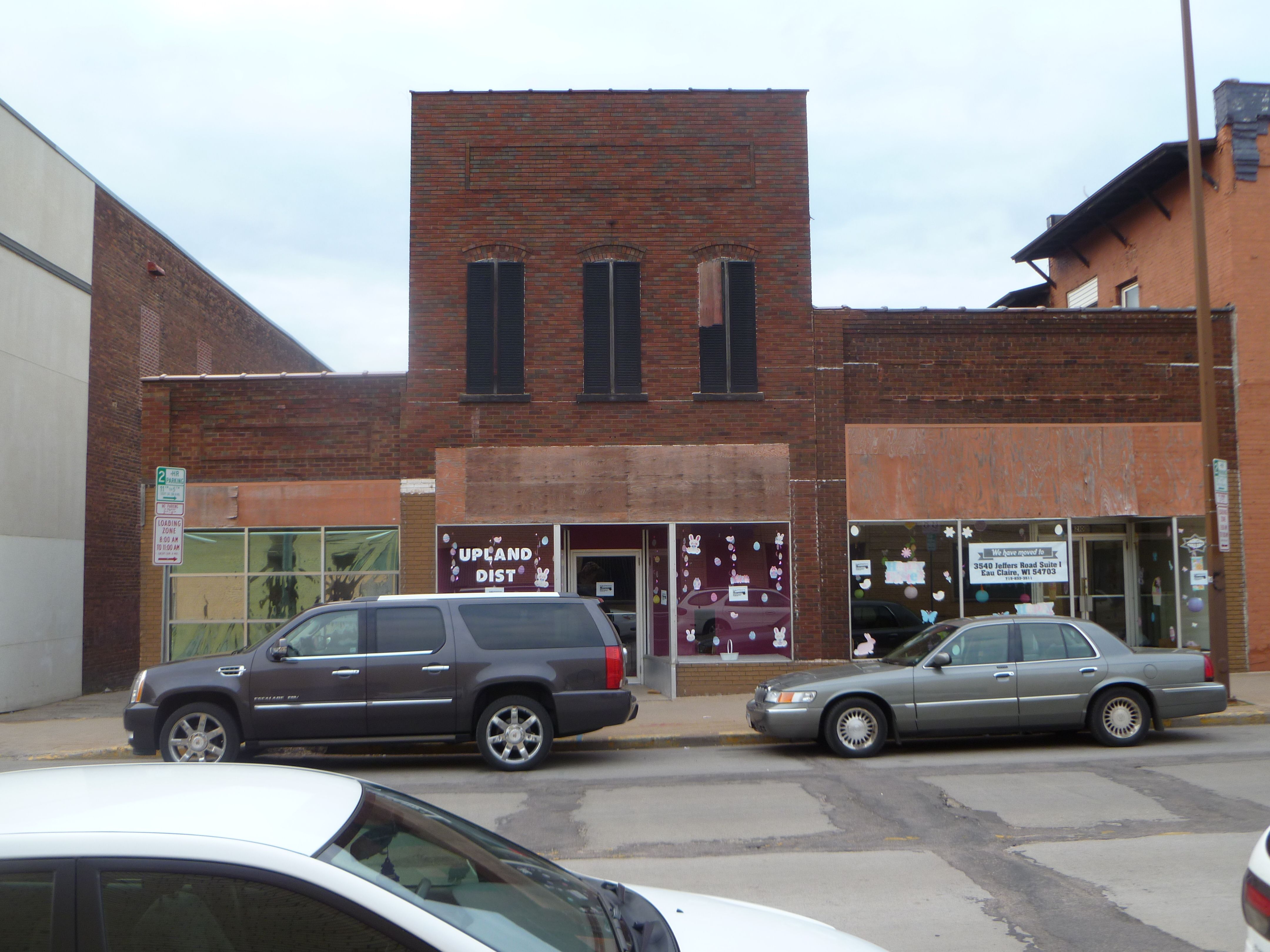
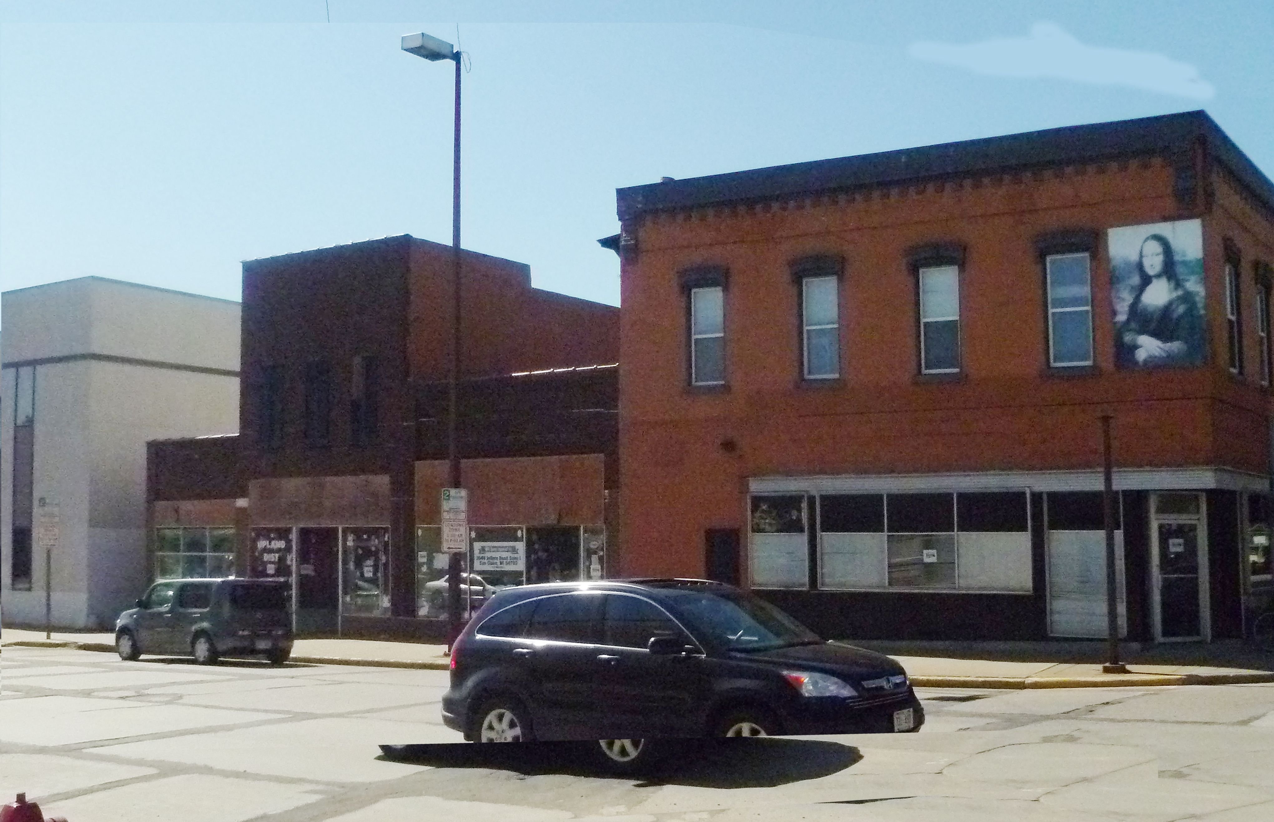
Now, here are a few detail images so you can see it a bit closer up.

When the painting was done, I gave this to my old boss as a gift, which he now proudly hangs in his new office!
I figured I’d share this painting with you since we are still in the gift giving season. And also in much of the world, that charming season of fresh white snow covering the old memories of the year gone by, symbolically cleansing and preparing a way for the bright promises of a new year!
Be blessed,

Share Your Thoughts!
Your paintings are amazing. You have such a remarkable gift. You are so inspiring to observe & I’ve learned so much just studying your post.
I was wondering on this painting how to paint tire tracks to suggest cars that once past through.
Thank you, Debbie! I’m glad my art has inspired you. God has been good to me and I thank Him for the gift He has given me. Painting tire tracks is a matter of capturing the shadow in the snow, which will be just a bit darker than the snow color. On a clear day it will be dark blue. Be blessed in your painting!